# Adapptio User Documentation
Deliver professional WEB applications in record time!
{% hint style="success" %}
[Sign up now for free!](https://adapptio.cloud/sign-up)
{% endhint %}
## What is Adapptio?
Adapptio is a cloud platform for building web applications in record time. It uses a next-gen development based on blueprint driven development and reactive programming. The platform allows you to set up your project within seconds, simply add integrations to your data sources, create front-end user interface and deliver end-to-end application 3x to 10x faster using Delphi/Visual Studio style editor. And finally, deploy your app to the cloud with a few clicks.
## What can I do with Adapptio?
Basically you can build any WEB application you want. \
Here are some use cases and examples for inspiration:
* [Complex SaaS Platforms](/working-with-adapptio/examples/saas-platforms)
* [Customers Portals](/working-with-adapptio/examples/customers-portals)
* [Information Systems](/working-with-adapptio/examples/information-systems)
* [Internal Tools](/working-with-adapptio/examples/internal-tools)
* [IoT Applications & Dashboards](/working-with-adapptio/examples/iot-applications)
* [Smart Portals](/working-with-adapptio/examples/smart-portals)
* [Analytics & Calculators](/working-with-adapptio/examples/analytics-and-calculators)
* [Statistics & Monitoring Panels](/working-with-adapptio/examples/statistics-and-monitoring-panels)
* [API Data Visualization](/working-with-adapptio/examples/api-data-visualization)
* [Simple Games](/working-with-adapptio/examples/simple-games)
## Adapptio is FREE!
Development in Adapptio is completely **FREE!** You start pay once you want to release your application for end-users. The actual prices you can find [here](https://www.adapptio.com/#pricing).
{% hint style="success" %}
[Sign up now for FREE!](https://adapptio.cloud/sign-up)
{% endhint %}
## Become a professional in a short period
Working with Adapptio is intuitive, especially for someone with programming and software architecture knowledge. You will be able to build any applications you want just after deploying your first application.
{% content-ref url="/pages/lGJ0UKMg04KdvPbYyLJb" %}
[Quickstart](/getting-started/quickstart)
{% endcontent-ref %}
### Cloud and security
We use the corporate data center of our parent company placed in Czech Republic with own cloud solution based on Kubernetes. The cloud and hardware solutions provide maximum flexibility and security to you. Applications, data, and passwords are fully encrypted, protected and we also know where exactly lies.
### On-Premise
If necessary, your entire project can be deployed on your side as well.
### Browsers and OS support
| Browser | Support |
| ---------------------------------------------------------------------------------------------------------------------------------------------------------------------------------------------------------------------------------------------------------------------------------------- | ------------------------------------------------------------------------------------------------------------------------------------------------------------------------------------------------------------------------------------------------------------------------------------------------------------------------------------------------------------------------------------------------------------------------------------------------------------ |
| Google Chrome |  Full support of latest versions |
|  Mozilla Firefox |  Full support of latest versions |
|  Opera |  Full support of latest versions |
|  Microsoft Edge |  Full support of latest versions |
|  Safari |  Style issues |
|  Internet Explorer |  Not supported |
# Quickstart
Deliver professional WEB applications in a record time!
The only think you need is an account, so sign up for free now.
{% hint style="success" %}
Step 1: [Create an account](https://adapptio.cloud/sign-up)
{% endhint %}
Making a new account is easy. You can use your existing Google account or create a new one with your e-mail. Please follow the link [www.adapptio.cloud](https://adapptio.cloud/sign-up), and get started now.
### Creating your first application
After new registration you will be prompted to enter your Organization name and Application name. It is filled with your name and `My First App` by default, but feel free to change it as you wish. Then click on Create button and you will be redirected to the application overview.
### Application overview
Just after a few seconds your editor will be ready to use and you can start creating your application. Click on the button OPEN EDITOR to continue. You can also manage your application using this page - in navigation you see detail, user management, infrastructure management and your subscription plans.
{% hint style="success" %}
Step 2: Open editor
{% endhint %}

The running application will be available after you deploy it from the editor.
### Build your first application
Opening an editor will allow you to work with graphical views representing web pages. Also, work with integrations to your systems and actions calling integrations to get data, transform them and pass to the views.
{% hint style="success" %}
Step 3: [Build Hello World application](https://www.youtube.com/watch?v=Oi4RFM2m-hc\&list=PLFsqe-Gje-xaWwaJsiecZsSy6TQMpf7Or)
{% endhint %}

You can preview your application in the upper-right corner by clicking on the eye icon. Closing the preview mode returns you to the editor, where you can try to run the application itself by clicking on the icon next to the the preview. It won't be possible till you click on the deploy button. Choose your production space, and you are ready to deploy.
{% hint style="success" %}
Step 4: Deploy your application
{% endhint %}

### Running your application
After deploying your application, it can be open directly from the editor, just click on the open application button next to the deploy button or outside of the editor in Adapptio platform by clicking on the OPEN APPLICATION button, wherever you can run, restart or stop your application.
{% hint style="success" %}
Step 5: Open your application
{% endhint %}

### Login into the application
Once the application is running and open, it is secured by our login screen. You can simply click to Login with Adapptio and follow the login process.
{% hint style="success" %}
Step 6: Sign in to your application
{% endhint %}

# Architecture Overview
Deliver professional WEB applications 3-5x faster!
The overall architecture of the Adapptio Framework is divided into several parts; Integrations, Actions, API Endpoints and Views. The Integrations, Actions and API Endpoints are running at the secured back-end in the Adapptio cloud; meanwhile, the Views are running at the client-side in your browser.
Integrations authenticate and call API, load static data, and connect databases using a secure proxy.
The actions permeate between the user interface and integrations and provide a secure connection, data transformation and pass data from integrations to the user interface and vice versa.
The Views represent a visual output of your applications run in a web browser on computers, tablets, or mobile devices.
The complete applications can be run in the Adapptio cloud or self hosted in your infrastructure.

{% content-ref url="/pages/3yog1GvnQKR507MntaqF" %}
[Views](/getting-started/architecture-overview/views)
{% endcontent-ref %}
{% content-ref url="/pages/1Z6dQmAoCXvd1gFZb4mw" %}
[Actions](/getting-started/architecture-overview/actions)
{% endcontent-ref %}
{% content-ref url="/pages/AhCrqES19FZQrLDNiJRE" %}
[Integrations](/getting-started/architecture-overview/integrations)
{% endcontent-ref %}
{% content-ref url="/pages/FeY23ZTneXdG3trVrtWB" %}
[API Endpoints](/getting-started/architecture-overview/api-endpoints)
{% endcontent-ref %}
{% content-ref url="/pages/8Iev3YFaghj9MzGU9Rww" %}
[Routes](/getting-started/architecture-overview/routes)
{% endcontent-ref %}
{% content-ref url="/pages/SdVOY64oLhCSNwW8tXfo" %}
[Events](/getting-started/architecture-overview/events)
{% endcontent-ref %}
{% content-ref url="/pages/4iLTtocKn1Y245Cj310W" %}
[Assets](/getting-started/architecture-overview/assets)
{% endcontent-ref %}
# Views
*Views* representing the graphical user interface contain as many components as required. Each application can be composed of many different *Views*, nested or opened as a solo page.
{% hint style="info" %}
Application **is always starting** from the *View* called **`MainView`**, and **it's mandatory**.
{% endhint %}

### 1. Creating and Working with a View
In the *Main Menu* settings, any new or existing *View* can be *created*, *renamed*, *duplicated*, *deleted*, *exported*, or *changed* in its parent directory.
{% tabs %}
{% tab title="Main Menu\[Create New View]" %}

{% endtab %}
{% tab title="Main Menu\[Name & Locate New View]" %}

{% endtab %}
{% tab title="Main Menu\[List of Existing Views & it's Options]" %}

{% endtab %}
{% endtabs %}
### 2. Views Tabs
Switching between opened *Views* can be done by clicking on its tabs and closing them by clicking on the cross icon.
{% hint style="info" %}
Any unsaved changes **will be lost** after closing a tab!
{% endhint %}
{% tabs %}
{% tab title="View\[Tabs & Closing]" %}

{% endtab %}
{% endtabs %}
### 3. Screen Resolutions
Switching between the screen resolution allows displaying proper responsivity on different devices. Each of the resolutions is represented by the pixel value, which can be modified if required.
{% hint style="info" %}
The **Base Screen** setting is considered to be a **default** in herity chain.
{% endhint %}
{% tabs %}
{% tab title="Base Screen" %}

{% endtab %}
{% tab title="Phone Screen" %}

{% endtab %}
{% tab title="Custom Pixel Ratio" %}

{% endtab %}
{% endtabs %}
### 4. Undo & Redo
Each of the existing *Views* has its own *undo* and *redo* steps if necessary.
{% tabs %}
{% tab title="Undo & Redo" %}

{% endtab %}
{% endtabs %}
### 5. Toggling the Panels
Resizing the *Canvas Work-field* during developing applications, especially on the smaller screens, can take advantage of by switching off the left and right panels by clicking on the *toggle buttons*.
{% tabs %}
{% tab title="Left Toggle Button" %}

{% endtab %}
{% tab title="Right Toggle Button" %}

{% endtab %}
{% endtabs %}
### 6. Saving a Current Content
The *Save button* will save the composition of a *current View*; meanwhile, *Save All button* will save all opened *tabs*, even *actions*, and *integrations*.
{% tabs %}
{% tab title="Save View Button" %}

{% endtab %}
{% tab title="Save All Application Button" %}

{% endtab %}
{% endtabs %}
### 7. View the Options Panel
The *Options Panel* allows direct work with a *current View*, like *renaming*, *moving* to different directories, *duplicating* actual content into a new *View*, *watching* revision history, *exporting* its content to *YAML*, and deleting the whole *View*.
{% hint style="info" %}
The Revision history would be available as soon as possible.
{% endhint %}
{% tabs %}
{% tab title="Options Panel" %}

{% endtab %}
{% endtabs %}
### 8. Design & Preview & Debug
1. The **Design Mode** is the essential part of designing *Views*. You can drag and drop components into *Canvas Work-field* and edit their properties.
2. The **Preview Mode** is representing the visual output of a current *View* and active components are fully available.
3. The **Debug Mode** shows the current *View* blueprint that is taking advantage of checking exported code. Any immediate changes are fully responsive.
{% tabs %}
{% tab title="Design Mode" %}

{% endtab %}
{% tab title="Preview Mode" %}

{% endtab %}
{% tab title="Debug Mode" %}

{% endtab %}
{% endtabs %}
# Actions
*Actions* represent a business logic of a broad spectrum of functions wired together in the *Flow Canvas*. They are commonly used to connect integrations, execute javascript code, and pass data to *Views* and vice versa.
*There exist three ways how to work with Actions in Adapptio.*
### 1. Binding a Data Source
*Adding Data from Action* provides a connection between *Views* and *Actions*, which can be referenced as a data source for any required component. *Action* must have `LOADED` status or be reloaded by the **Update State** *Method* from Events.
{% tabs %}
{% tab title="Outline Panel" %}

{% endtab %}
{% tab title="Inspector" %}

{% endtab %}
{% tab title="Data Explorer" %}

{% endtab %}
{% tab title="Event\[Update State]" %}

{% endtab %}
{% endtabs %}
### 2. Calling an Action from an Event
The following way to call *Actions* is by the **Call Action** *Method* from *Events*. Any existing components can trigger it depending on the required *Event Logic*.
{% tabs %}
{% tab title="Event\[Call Action]" %}

{% endtab %}
{% tab title="Call Action\[Settings]" %}

{% endtab %}
{% endtabs %}
### 3. Scheduling an Action
Scheduling *Actions* are independent of any superior Views and are executed once or in specific intervals at the backend.
{% tabs %}
{% tab title="Action Settings" %}

{% endtab %}
{% endtabs %}
# Integrations
The *Integrations* are providing a data connector between the required *Datasource* and *Actions*.

### 1. Creating a New Integration
Simply click on the *Create New* option in the *Main Menu*, select the required *Integration*, name it, and place it in the desired location.
{% tabs %}
{% tab title="Create New Integration" %}

{% endtab %}
{% tab title="Selecting New Integration" %}

{% endtab %}
{% tab title="Naming & Selecting location" %}

{% endtab %}
{% endtabs %}
### 2. Working with Integrations
Any existing *Integration* can be *renamed*, *moved*, *duplicated*, or *deleted* in the *Main Menu*; click on the *Options field*.
{% tabs %}
{% tab title="Editing Integrations" %}

{% endtab %}
{% endtabs %}
### 3. Configuring Integrations
Each of the *Adapptio Integrations* has its properties, which must be configured appropriately. Clicking on the existing *Integration* will open the properties window.
{% tabs %}
{% tab title="Configuring Integration" %}

{% endtab %}
{% endtabs %}
### 4. Connecting Integrations into the Actions
*Functions* become available in the *Action Flowchart Editor* with the existing *Integration*. We can wire together all desired functions from this moment, depending on what kind of *Action* we are doing. It will be mostly about reading, uploading, editing, and deleting bound *Datasource*.
{% tabs %}
{% tab title="Action Flowchart\[Available Integration Functions]" %}

{% endtab %}
{% tab title="Action Flowchart\[Canvas]" %}

{% endtab %}
{% endtabs %}
### 5. List of Available Integrations
The most required *Integrations* like working with databases and *rest API* are available in the Adapptio. Our team is consistently developing new implementations.
{% hint style="info" %}
Missing some *Integration*? Don't hesitate to ask for our support team or community forum.
{% endhint %}
| Adapptio Icons | Name of Integrations |
| ------------------------------------------------------------------------------------------------------------------------------------------------------------------------------------------------------------------- | -------------------- |
|  | **graphQL** |
|  | **inMemoryDB** |
|  | **gRPC** |
|  | **influxDB** |
|  | **REST API** |
|  | **Static Text** |
|  | **Static CSV** |
|  | **Static YAML** |
|  | **Static JSON** |
|  | **Static XML** |
|  | **PostgreSQL** |
|  | **MySQL** |
|  | **MS SQL** |
|  | **Oracle DB** |
|  | **SMTP Client** |
|  | **AWS S3** |
# API Endpoints
Endpoints enable to access application using API. You can specify full configuration of path, method, validate body using schema and so on.
{% hint style="info" %}
The endpoint will be registered in `/endpoints/v1/`
{% endhint %}
# Routes
Routes allow you to define custom URLs paths that the Routes component can respond to, switching content based on the route URL.
To add any new route, just open `routes` resource from the main menu.
The key is autogenerated and serves for dynamic referencing a route. The label is user friendly name and the path is URL path. You can also include a parameter, which starts with `:`.
For example, route UserDetail can look like `/users/id/:userId` -> this route will have a single parameter called userId.
All registered routes are available in some components which support Link property.
For example, this settings make from button a link to the Signup route -> after click you will see the url in your browser or in Tester.
{% hint style="warning" %}
Link to a route changes the URL address, but has no influence on the content. For defining content you need to use the Routes component.
{% endhint %}
# Events
The *Events* are conditionally triggered *Methods* if something happens. In terms of distribution, we can split *Events* into two groups; one group is bound with *Views*, and the second one is attached with the *Components*.

### 1. Components Events
Except for a few *Layout components* rest of them can edit *Events* by clicking on the flash icon, choosing the proprietary *Method*, and configuring *Event* logic with the *Flowchart* wire editor.
{% tabs %}
{% tab title="Button\[onClick] Event" %}

{% endtab %}
{% tab title="Flowchart Editor" %}
{% endtab %}
{% endtabs %}
### 2. Views Events
Each of the existing application *Views* has an option to edit its *Events* on Initialize and when the input parameters are changed — even in editing *Views Events*, configuring *Event* logic with the *Flowchart* wire editor.
{% tabs %}
{% tab title="View Events Settings" %}

{% endtab %}
{% endtabs %}
# Assets
Assets provide a simple way how to upload project related resources, such as images (logo, background, fav icons) or some static files.
To add a new asset, click Asset in the main menu, select file and click upload. The asset will be uploaded into your project and you can access it anytime.
You can also preview the asset in the editor and copy the address of the resource.
# Editor
Deliver professional WEB applications 3-5x faster!
The graphics user interface represents the visual output of a whole application, and it's mainly used for designing and connecting existing actions and data structures. The design of applications is composed of canvas drag and drop work-field by many different components placed in views, which are used as standalone pages or as subelements of other views.

All existing or new elements, like actions, integrations, or views, are placed in a directory structure with the possibility of sorting out files, renaming, moving, or deleting them. If desired, there is also an option to make other sub-directories by choosing it from Create a new menu.
### Canvas GUI Editor
Canvas graphical user interface editor shows us the content of personal views, with the option for switching between design, preview or debug mode.
### Design Mode
The Design Mode represents the output layout composed of a single components. You can drag and drop elements, define their parameters, and bond them with existing actions.

### Preview Mode
Preview Mode shows views represented by a web browser without deploying them.

### Debug Mode
The Debug Mode is read-only, showing a complete blueprint traceable case of the actual view.

# Main Menu
The roll-up setting allows configuring the whole application environment, like creating new resources files, editing them, sorting directories, managing access rights, etc.

# Create New Resources
Creating a new View, Action, or Integration is easy and intuitive. Simply click on a required element, name it, and associate it with a specific directory.
{% tabs %}
{% tab title="Create New View" %}

{% endtab %}
{% tab title="Create New Action" %}

{% endtab %}
{% tab title="Create New Integration" %}

{% endtab %}
{% endtabs %}
Structuring is essential for the growth of an application. Each existing or new file has its directory location and can be renamed, moved, duplicated, or deleted. If necessary, extending an application of subdirectories makes it possible to create a new one.
Any required files can be opened in the editor by clicking on.
# Manage the Application
The application settings open a new platform window if necessary.
Editing access rights and permissions allow login to the application by authorized users.
Deployments allow checking the actual cloud setting of the application environment.
# Monitoring Errors
{% content-ref url="/pages/srAwRKvVBif9AGSNgle3" %}
[Error Monitor](/getting-started/editor/main-toolbar/error-monitor)
{% endcontent-ref %}
# Main Toolbar
Editor main toolbar allows deploying, running, and previewing the application with the possibility of checking error issues.

# Deploying the Application
Deploying the application to a required environment is simply done by selecting the production Name and clicking on the Deploy button. If there are no health issues, the application will be deployed in a short while.
# Opening the Application
Opening the application is possible right after deploying. Authorized users are allowed to log in, provided that the application is not publicly accessible.

# Preview Mode
A preview of the application is independent of deployment. It's run directly in a browser without the possibility to run it out of the editor. There are two layers of preview modes. First is clicking by eye icon at Main Toolbar;

; the second is switching on the toolbar of the current View.

The main difference is switching between the preview of the whole application and the current View.
# Error Monitor
Checking the health of your application is essential to avoid potential errors and mistakes. The monitor separates announcements between errors, warnings, hints, and info.
Switching into the Error monitor view can be done by clicking on the warning icon in the Main toolbar or from the application environment.
# Components Panel
The Components Panel allows switching between all available components, configuration inspector, and set of the current view.

{% tabs %}
{% tab title="Components" %}

{% endtab %}
{% tab title="Inspector" %}

{% endtab %}
{% tab title="View Setting" %}

{% endtab %}
{% endtabs %}
# Components
The Components are the basic building blocks, primarily representing a visual representation of a whole application. Each component has its properties, set up as constant values or defined from a dynamic source.
{% tabs %}
{% tab title="Components Search" %}

{% endtab %}
{% tab title="Components Groups" %}

{% endtab %}
{% endtabs %}
Searching filter between components is handy, especially for intermediate users with knowledge of their names. Searching filter between components is handy, especially for intermediate users with knowledge of their names. Switching between components grid display even can save some time.
{% tabs %}
{% tab title="List Name Resolve" %}

{% endtab %}
{% tab title="Group Name Resolve" %}

{% endtab %}
{% endtabs %}
The active component and parent sorting will appear in the Outline panel right after drag and drop in the canvas work field. The component can be sorted out from that moment, and its properties become editable.

The complete list of available components and their properties are described in the Reference Guide.
{% content-ref url="/pages/MJVRJvSAOrDtymLYCBX9" %}
[Components List](/reference-guide/components-list)
{% endcontent-ref %}
# Inspector
The Inspector allows editing all properties and attributes of the currently selected component. A unique ID name is automatically generated in numeric order, and it's essentially important to rename it to fitting an application purpose. The component itself can even be deleted or triggered by the help button of the referencing guide.
{% tabs %}
{% tab title="Component Type" %}

{% endtab %}
{% tab title="Unique ID" %}

{% endtab %}
{% tab title="Delete Button" %}

{% endtab %}
{% tab title="Reference Guide" %}

{% endtab %}
{% endtabs %}
Each component has different expandable groups and types of properties, which can be set up as a constant value or bound dynamically by a specific data source. Any wrong syntax will be evaluated as a warning.
{% tabs %}
{% tab title="Shrinked Properties" %}

{% endtab %}
{% tab title="Expanded Properties" %}

{% endtab %}
{% tab title="Function Binding" %}

{% hint style="info" %}
ƒx -> specify the value of the existing *myText* String variable
{% endhint %}
{% endtab %}
{% endtabs %}
A description of all available properties can be found in the Reference Guide.
{% content-ref url="/pages/E1ZVF4zDUp4VgIXsIPdP" %}
[Properties](/reference-guide/properties)
{% endcontent-ref %}
Each component has configurable specific events logic that can be added directly by selecting the desired one from the inspector panel or by clicking by opening the Events Console.
{% tabs %}
{% tab title="Events Panel" %}

{% endtab %}
{% tab title="Direct Logic Selection" %}

{% endtab %}
{% tab title="Event Console" %}

{% endtab %}
{% endtabs %}
Following the Events Referencing Guide to acquire knowledge of how it works.
{% content-ref url="/pages/SdVOY64oLhCSNwW8tXfo" %}
[Events](/getting-started/architecture-overview/events)
{% endcontent-ref %}
If required, it's possible to add internal comments on what brings the advantage of noticing unfinished work or passing information to the team developers.
{% tabs %}
{% tab title="Comment Panel" %}

{% endtab %}
{% tab title="Adding New Comment" %}

{% endtab %}
{% tab title="Resolving Comments" %}

{% endtab %}
{% endtabs %}
# View Settings
Any of the implemented Views has its independent settings from each other. Giving it a proper name and description does not affect the visible or logical output and serves just for internal use; for example, it's handy for team-developed applications.
{% tabs %}
{% tab title="Options Settings" %}

{% endtab %}
{% tab title="Title and Description" %}

{% endtab %}
{% tab title="Code Editor Desription" %}
{% endtab %}
{% endtabs %}
The required authenticated user verifies if the current user ID is not a null value, preventing access of the View to non-authorized persons. Binding access rights with specific condition rules expand accessibility options; in our case, an already logged user has to have a specified Name.
{% tabs %}
{% tab title="Require Authenticated User" %}

{% endtab %}
{% tab title="Authorization Condition" %}

{% endtab %}
{% tab title="Code Editor Description" %}
```
IF(currentUser.firstName == "Martin", true, false)
```
{% endtab %}
{% endtabs %}
If any of the input parameters are changed, reinitializing the output of a View is triggered.

Setting up the virtual URL address of the current View is handy with the logical route component, where instead of its ID targeting nomenclature.

Two different Events methods are triggered by initialization or when the input parameters are changed. Both of the methods are not dependent on each other. Events logic can be added directly by selecting the desired one from the Events panel or clicking on the required action.
{% tabs %}
{% tab title="Events Settings" %}

{% endtab %}
{% tab title="Direct Logic Selection" %}

{% endtab %}
{% tab title="Event Console" %}

{% endtab %}
{% endtabs %}
# Outline Panel
Outline panel showing list of active components, bound actions, and variables, superior to the current View.
Except for components, adding new data or variables can be done by clicking on the plus button and choosing the required one.

# Data Variables
A Datasource bound with the current View is separated into state variables, and variables returned by a specific action. Adding the new variable can be done by simply clicking on the plus button and choosing the required one.
{% tabs %}
{% tab title="Adding New Datasource" %}

{% endtab %}
{% tab title="Action Data" %}

{% endtab %}
{% tab title="State Variable" %}

{% endtab %}
{% endtabs %}
# State Variable
Any View can contain as many state variables as required, and its value can be set up as a constant or bound dynamically. State variables are not accessible between other Views; this means that every View can contain the same-named variables serving a different purpose.
Each of the variables has a unique ID, value, and type. Selecting the desired variable allows one to set up attributes in the Inspector panel. There is also an option to delete the current variable.
{% tabs %}
{% tab title="Inspector Option" %}

{% endtab %}
{% tab title="Variable ID" %}

{% endtab %}
{% tab title="Options Settings" %}

{% endtab %}
{% tab title="Delete Variable" %}

{% endtab %}
{% endtabs %}
Value types of state variables are dependent on their usage. The most common String value is set up as a default, but options for Number, Boolean, Password, Map, and Array are also set up. Value-type can be changed by clicking on the proper icon.
{% tabs %}
{% tab title="String" %}

*`ƒx: "Hello World"`*

{% endtab %}
{% tab title="Number" %}

*`ƒx: 123`*

{% endtab %}
{% tab title="Boolean" %}

*`ƒx: true`*

{% endtab %}
{% tab title="Password" %}

*ƒx: `"TopSecret123"`*

{% endtab %}
{% endtabs %}
{% tabs %}
{% tab title="Adding Map Items" %}

*ƒx: {first: "value1", second: "value2"}*

{% endtab %}
{% tab title="Editing Items Values" %}

{% endtab %}
{% tab title="Deleting Map Items" %}

{% endtab %}
{% tab title="Define Items Valuetypes" %}

{% endtab %}
{% endtabs %}
{% tabs %}
{% tab title="Adding Array Items" %}

*ƒx: \["value1", "value2"]*

{% endtab %}
{% tab title="Editing Items Values" %}

{% endtab %}
{% tab title="Deleting Array Items" %}

{% endtab %}
{% tab title="Define Items Valuetype" %}

{% endtab %}
{% endtabs %}
All existing state variables and their values are visible in Data explorer. Any changes in names or values are immediately reflected.
{% tabs %}
{% tab title="String State Variable" %}

{% endtab %}
{% tab title="Data Explorer State Variable" %}

{% endtab %}
{% endtabs %}
Referencing variable values have to always correspond with Data explorer annotations.
```
variable1.value
```
Even updating a state of the variable by calling the proper function has to hold the correct syntax.
{% tabs %}
{% tab title="Updating State by Event" %}

{% endtab %}
{% tab title="Update State Configuration" %}

{% endtab %}
{% endtabs %}
State variables can refer to each other.
{% tabs %}
{% tab title="Referencing To Logged User" %}

{% endtab %}
{% tab title="Associating Variable To Component" %}

{% endtab %}
{% tab title="Output" %}

{% endtab %}
{% endtabs %}
# Data From Action
{% hint style="info" %}
Under construction
{% endhint %}
# Data Explorer
Data Explorer is showing a statement of all existing components, variables, and actions allowing to reference correct annotations and functions.
Referencing values have always kept the structure of nested elements.
{% tabs %}
{% tab title="Referencing Values" %}

```
task.data.name
```
{% endtab %}
{% tab title="Associating Component Value" %}

{% endtab %}
{% tab title="Output" %}

{% endtab %}
{% endtabs %}
Any associated function of a current component is marked and can be called by updating the state of a required event.
{% tabs %}
{% tab title="Referencing Functions" %}

{% endtab %}
{% tab title="Update State Event" %}

{% endtab %}
{% tab title="State Event Set Up" %}

{% endtab %}
{% endtabs %}
# Console
The console shows the complete statement of the current application, mostly referencing health issues.
{% content-ref url="/pages/srAwRKvVBif9AGSNgle3" %}
[Error Monitor](/getting-started/editor/main-toolbar/error-monitor)
{% endcontent-ref %}
# Playground
Try free playground and explore Adapptio now!
A fully interactive playground will help you to learn the basics of the Adapptio Editor without any registration. It lives only in your browser and so no data will be persisted.
Anytime you are ready to build a real full-featured app just click on the “Build Real App” button in the top right corner.
{% embed url="" %}
# Best Practices
## Project Structure
Create assets, views, actions and integrations in the proper folder. It helps you to orient in your project.
{% hint style="info" %}
To reuse the same content, create a View and embed it as a widget using View component.
{% endhint %}
## Resource Naming
We recomend to use PascalCase style with dots.
**Integration** - name it as `type.description`.
Examples:
```
Api.MyBackend
Db.MyDatabase
```
**Action** - start with a verb describing purpose of the action.
Examples:
```
GetUsers
InsertArticle
```
**View** - name should represent a page content.
Examples:
```
Users
AddArticle
```
## Variable Naming
Use noun related to the data that the variable contains. We recommend to use camelCase style.
Examples:
```
users (calling action GetUsers)
buttonState (represents on / off state)
```
## Component Naming
We recommend to start each name of any component with three abbreviation letter and continue with component description with camelCase style:
* container - cnt
* box - box
* sidebar - sdb
* app header - hdr
* advanced table - adt
* data table - dtb
* pagination - pgn
* text - txt
* label - lbl
* icon - icn
* image - img
* all fields - fld
* button - btn
* menu button - mnb
* property item - pri
* repeat - rpt
* routes - rts
* one of - onf
* qr code - qrc
* composed chart - cmc
* view - view
# Tutorials
Step by step tutorials
# 1. Hello World
How to build an application based on blueprint driven development and reactive programming?
### The Goal
Prepare a basic responsive application, reflecting *Input Field* value into two *Text components*, where one should be a *String* and the second one a *Function*.

### The Description
Any changes you will make to any existing *Components* are fully responsive. In our case, we are placing one *Text Input* and two *Text components* into the *Canvas work-field*. First, the *Text* output would be bound as a `constant Value`; the second one would be mapped `dynamically` by a *Function*.
### The Knowledge You Will Get
1. Responsive notion.
2. Working with *Components* and their properties.
3. Understand the difference between *Constant* and *Dynamic Values*.
### The Project Structure
{% tabs %}
{% tab title="View\[MainView]" %}
MainView
* [ ] Container\[cntHelloWorld]
* [ ] Text Input\[fldInpName]
* [ ] Text\[txtString]
* [ ] Text\[txtFunction]
{% endtab %}
{% endtabs %}
### 1. Prepare your MainView Canvas
The `MainView` is an inseparable part of all applications and is superior to any other *Views*. You can put components directly to the `MainView` *Canvas* or start by creating a new one.
{% hint style="info" %}
Keep in mind that the application is always run from the `MainView`. Mean, if you use another one, you won't see any results after deployment till you will bind `MainView` with a *View component*.
{% endhint %}
Let's say that we will stay in `MainView` for this tutorial.
1. Find a **Container** and drag and drop it to your `MainView` *Canvas* from the *Component Panel*.
2. Rename its *ID* to `cntHelloWorld` at the *Inspector Panel*. You can also see the `name` change in the *Outline Panel* at that time*.*
1. Set up *Common* -> *Flow* on `Under each other`, telling us sorting of child components.
2. *Common* -> *Horizontal Alignment* -> `Center` and *Vertical Alignment* -> `Middle` ensuring position of all placed components right in the middle.
3. *Style* -> *Spacing* -> `Medium` is set up distance between all child components.
4. The last setting of the `cntHelloWorld` *Container* has to be *Layout* -> *Item Flex* -> `Stretch` filling full content *View*.
{% tabs %}
{% tab title="Canvas\[MainView]" %}

{% endtab %}
{% tab title="Outline\[MainView]" %}

{% endtab %}
{% tab title="Inspector\[Common]" %}

{% endtab %}
{% tab title="Inspector\[Style]" %}

{% endtab %}
{% tab title="Inspector\[Layout]" %}

{% endtab %}
{% endtabs %}
### 2. Placing Components into Container
Place three components into `cntHelloWorld` *Container* and set up their properties.
1. First, put into `cntHelloWorld` **Text Input** from *Component Panel* and set up its *ID* -> `fldInpName` following next properties:
1. *Common* -> *Value* -> "`...`" showing content of `fldInpName` by a *Default*.
2. *Common* -> *Placeholder* -> "`Input your name`" ensure hint of the *Text Input* unless its empty *Value*; for example, if you will delete "`...`" when the application will run.
3. *Layout* -> *Width* -> `200px` forcing to keep the pixel width of the *Text Input*.
2. The Next component would be a **Text** that *ID* set up on `txtString`. Keep the *Value* empty for a moment and continue with other properties:
1. *Common* -> *Text Style* -> `Bold` and *Font Size* -> `Large` defines graphical output style of `txtString`.
3. The Last component would be a Text also with *ID* -> `txtFunction`. Even here keep Value blanc and set up as follows:
1. *Common* -> *Text Style* -> `Bold`; *Font Size* -> `Large`; *Foreground* -> `RED` what represents graphical output of `txtString`.
{% tabs %}
{% tab title="Canvas\[cntHelloWorld]" %}

{% endtab %}
{% tab title="Outline\[MainView]" %}

{% endtab %}
{% endtabs %}
### 3. Bind Components Together
Both *Text Components* have to assume the *Value* of the *Text Input*. We can make it in two ways; first, *Text Input* will stay as a *constant Value*; the second one will be switched to a *Function*.
{% hint style="info" %}
Any associable *Values* and callable *Functions* of the existing *Components* can be referenced by matching the structure in the *Data Explorer*.
{% endhint %}
1. Set up `txtString` *Common* -> *Value* -> `Hello, ${fldInpName.value}`
2. Switch on *Function* of `txtFunction` by clicking on *ƒx* icon on the right side of the *Value property*.
3. Set up `txtFunction` *Common* -> *Value* -> `"Hello, " + fldInpName.value`
{% hint style="info" %}
You will see "Hello, ..." *Text output* at both *Text Components* if you did it right*.*
{% endhint %}
{% tabs %}
{% tab title="Canvas\[Main View]" %}

{% endtab %}
{% tab title="Code Editor\[txtString Value]" %}

{% endtab %}
{% tab title="Code Editor\[txtFunction Value]" %}

{% endtab %}
{% endtabs %}
### The Conclusion
The *constant Value* and *Dynamic Function* are interconnected, and both settings are valid. Referencing *Function* from *String* has to be annotated by `${function}`; meanwhile, referencing *String* from *Function* has `“string”` annotation.
# 2. Visualize Data from API
How to easily display data from REST API backend?
### The Goal
Prepare a basic *Customer Search* application connecting data using *REST API* *Integration*.

### The Description
Typical usage of the *REST API Integration* can be loading data from a JSON server, in our case, *Mock API*. We will connect to customer data which content would be a part of the *Advanced Table* filtered by a dynamic search field. Additionally, each *Table record* has its icon triggering the e-mail client.
### The Knowledge You Will Get
1. How to use the REST API Integration.
2. Working with an Advanced Table.
3. Triggering an E-mail client.
### The Project Structure
{% tabs %}
{% tab title="View\[MainView]" %}
* [ ] Data from Action\[`customers`]
* [ ] View\[`MainView`]
* [ ] Container\[`cntRoot`]
* [ ] Label\[`heading`]
* [ ] Text Input\[`fldSearch`]
* [ ] Advanced Table\[`tblCustomers`]
* [ ] Column1
* [ ] Text\[`txtFirstName`]
* [ ] Column2
* [ ] Text\[`txtLastName`]
* [ ] Column3
* [ ] Text\[`txtEmail`]
* [ ] Column4
* [ ] Text\[`txtCompany`]
* [ ] Column5
* [ ] Button\[`btnSendEmail`]
{% endtab %}
{% tab title="Action" %}
* [ ] `GetCustomers`
{% endtab %}
{% tab title="Integration" %}
* [ ] `MyRestApi`
{% endtab %}
{% endtabs %}
### 1. Prepare a Basic Layout
As usual, let's start with a *Layout* preparation. The *Main Container* will contain a *Header*, *Search Field*, and *Advanced Table*.
1. Place in `MainView` a **Container**, name its *ID* -> `cntRoot`, and configure it as follows:
1. *Flow* -> `Under each Other`; *Horizontal Alignment* -> `Stretch`; *Padding* -> `X-Wide`; *Spacing* -> `Medium`;
2. As a *Header*, we will simply use a **Label** with the *ID* -> `heading`.
1. Set up `heading` properties: *Value* -> "`Customers`"; *Font Size* -> `XLARGE`;
2. *Icon* -> *Name* -> "`mdi/briefcase-account`"; *Size* -> `Large`; *Flow* -> `Icon left`
3. *Style* -> *Horizontal Alignment* -> `Left`; *Vertical Alignment* -> `Middle`
3. Put in a **Text Input** component, serving as *Search Field*. Name its *ID* -> `fldSearch`, and it's *Placeholder* -> "`Search...`"
4. The last component will be an **Advanced Table** carrying *ID* -> `tblCustomers`; *Spacing* -> `Medium`;
1. Add *five Columns* and simply name them as follows: `First Name`; `Last Name`; `Email`; `Company`; `#5`
2. Set up *Column* `#5` *Width* -> `36px`
3. Place to each of the *Columns* the following components:
1. **Text** -> *ID* -> `txtFirstName`
2. **Text** -> *ID* -> `txtLastName`
3. **Text** -> *ID* -> `txtEmail`
4. **Text** -> *ID* -> `txtCompany`
5. **Button** -> *ID* -> `btnSendEmail`; *Value* -> ""; *Icon* -> *Name* -> "`mdi/email-edit`"; *Size* -> `Medium`
1. *Style* -> *Button Style* -> Custom; *Background* -> `Transparent`; *Foreground* -> `Secondary`; *Border Color* -> `LIGHT_GRAY`; *Border Width* -> `1px`
2. *Custom hover state* -> *Background* -> `Transparent`; *Foreground* -> `PRIMARY`; *Border Color* -> `PRIMARY`
{% tabs %}
{% tab title="Canvas\[MainView]" %}

{% endtab %}
{% tab title="Current Components" %}

{% endtab %}
{% endtabs %}
### 2. Connect the Rest API Integration
Don't hesitate to use our *JSON Server* or use your own. The *Base URL* of the *Server configuration* has to exclude the customer data subdirectory, which would be targeted further by an *Action*.
{% hint style="info" %}
Keep in mind that targeted data must be in a valid JSON format.
{% endhint %}
```json
[
{
"id":0,
"first_name":"Douglas",
"last_name":"Brakus",
"email":"Gutmann_Preston@yahoo.com"
,"company":"Effertz and Sons"
}
]
```
1. Create a new **Rest API Integration**, name it `MyRestApi` and configure as follows:
1. *Base URL* -> "[`https://mockapi.adapptio.app/2c932729/rest`](https://mockapi.adapptio.app/2c932729/rest)"
2. *API Timeout* -> `10000`
2. Save it and continue with the next steps.
### 3. Create a `GetCustomers` Action
The `GetCustomers` *Action* provides a bridge between `MyRestApi` *Integration* and *Datasource* bound in the `MainView`, which we will configure in the upcoming step. Input search parameter equals *GET Query String*.
{% hint style="info" %}
If additional *Query parameters* are required, it has to be solved on the side of the input parameter.
{% endhint %}
```
// Example: $QueryParam + "?limit=5"
```
1. Create a **Action** and name it `GetCustomers`.
2. Add a **Parameter** with *ID* -> `search`; *String*
3. *On Start* ->Place a **REST API / Request** from *Functions / Integrations Panel* and configure it as follows:
1. *ID* -> `apiReq`; *Parameters URL* -> "`/customers`"
2. Add a new *Query*, name it `q` and set up its Value as *ƒx Function* -> `params.search`
4. Wire together a new **Output** and set up its *Return value* -> `apiReq.data`
{% tabs %}
{% tab title="Flow Canvas\[GetCustomers]" %}

{% endtab %}
{% tab title="GetCustomers\[REST API / Request]" %}

{% endtab %}
{% tab title="REST API / Request\[q]" %}

{% endtab %}
{% endtabs %}
### 4. Bind the `GetCustomer` Action with `customers` Datasource
Somehow we have to bind our *REST API data* with *MainView*. We have to *Add Data from Action* in *Outline Panel* for such a reason.
1. Click on **Add Data from Action** and name it `customers`
2. Select by clicking on *Action Name* -> `GetCustomers`
3. Bind *Search field Value* with *Input parameter* by *ƒx Function* on *search* -> `fldSearch.value`
{% tabs %}
{% tab title="Outline Panel\[Main View]" %}

{% endtab %}
{% tab title="customers\[Properties]" %}

{% endtab %}
{% endtabs %}
### 5. Associate `customers` Datasource with `tblCustomers` Table
Associating `customers` *Datasource* with our *Advanced Table* items is the last step in making our application live.
{% hint style="info" %}
Watch the difference between annotation in binding `items` *Datasource* and *Values* of included components, where its *Value* is `item`.
{% endhint %}
1. Switch on `tblCustomers` *Properties* and edit *Items* -> `customers.data` (*ƒx)*
2. Associate all *Columns components*, except Button, with the following *Functions*:
1. `txtFirstName` -> *Value* -> `item.first_name` (*ƒx)*
2. `txtLastName` -> *Value* -> `item.last_name` (*ƒx)*
3. `txtEmail` -> *Value* -> `item.email` (*ƒx)*
4. `txtCompany` -> *Value* -> `item.company` (*ƒx)*
{% tabs %}
{% tab title="tblCustomers\[Items]" %}

{% endtab %}
{% tab title="txtFirstName\[Value ƒx]" %}

{% endtab %}
{% endtabs %}
### 6. Add on Click Event to Send Email
The last step in our application process is to associate an *Event* on *Click* `btnSendEmail` *Button*.
1. Switch on `btnSendEmail` and create a new **Event** by clicking on *Click* in *Inspector Panel*.
2. *On Event* -> Add a **Navigate** *function*, wire it together and set it up as follows:
1. *Options* -> *Link Type* -> `URL`; *URL Address* -> `mailto:${item.email}`
{% tabs %}
{% tab title="Canvas Event\[btnSendEmail\[Click]]" %}

{% endtab %}
{% tab title="btnSendEmail\[Navigate]" %}

{% endtab %}
{% endtabs %}
### The Conclusion
*REST API* belongs with *Databases* in one of the most used Integrations in the Adapptio. Try to bind another free online *JSON Servers*.
# 3. Advanced Layout Application
How to create an application with advanced professional layout?
### The Goal
Compose an *Advanced Layout* application switching between different *Views* by the *Routes*.

### The Description
The principle of the *Route* component is in switching between the exact URL addresses based on the unique *Views IDs*. Component option settings change any matched route, including the exact home page, specific Views, or non-existing addresses.
{% hint style="info" %}
Be noticed that the application URL address is always in the following format: `ApplicationURL/view/view_id`
{% endhint %}
All *Defined Routes* are matched from top to bottom, which means it's essential to prepare *Routes* heading from the home page, followed by specific *View IDs*, ending with the non-existing content.
{% hint style="info" %}
1. `home` -> `exact ApplicationURL`
2. `view` -> `ApplicationURL/view/view_id`
3. `home` -> `non-exact ApplicationURL`
{% endhint %}
### The Knowledge I Will Get
1. Switching between Views using the Routes.
2. Referencing dynamic values from Data Explorer.
3. How to Logout the application.
### The Project Structure
{% tabs %}
{% tab title="View\[MainView]" %}
* [ ] MainView
* [ ] Application Header\[hdrMain]
* [ ] Text\[txtAppName]
* [ ] Menu Button\[mnbMain]
* [ ] Sidebar Layout\[sdbMain]
* [ ] Content(content)
* [ ] Routes\[rtsMain]
* [ ] Option #1
* [ ] View\[viewHome]
* [ ] Option #2
* [ ] View\[viewDynamic]
* [ ] Option #3
* [ ] Container\[cntNotFound]
* [ ] Label\[lblNotFound]
* [ ] Content(sidebar)
* [ ] Box\[boxBackground]
* [ ] Navigation Tree\[trnNavigation]
{% endtab %}
{% tab title="View\[ViewA]" %}
* [ ] ViewA
* [ ] Container\[cntRoot]
* [ ] Label\[lblTitle]
{% endtab %}
{% tab title="View\[ViewB]" %}
* [ ] ViewB
* [ ] Container\[cntRoot]
* [ ] Label\[lblTitle]
{% endtab %}
{% tab title="View\[ViewHome]" %}
* [ ] ViewHome
* [ ] Container\[cntRoot]
* [ ] Label\[lblTitle]
{% endtab %}
{% tab title="View\[ViewProfil]" %}
* [ ] ViewProfil
* [ ] Container\[cntRoot]
* [ ] Label\[lblTitle]
{% endtab %}
{% endtabs %}
### 1. Prepare a Sub-Pages
First, let's prepare four sub-*Views* serving as basic elements of the `MainView`. Its structure would be the same, just with different content.
1. Structure of all sub-*Views*:
1. Place in a **Container** named *ID* -> `cntRoot`; *Padding* -> `Wide`; *Spacing* -> `Medium`; *Item Flex* -> `Stretch`
1. Into the `cntRoot` put a **Label** with *ID* -> `lblTitle`; *Text Style* -> `Bold`; *Font Size* -> `MEDIUM`; *Icon Size* -> `Medium`
2. Create the following **Views** and upgrade their Properties:
1. *ID* -> `ViewA`; `lblTitle` -> *Value* -> "`ViewA`"; *Icon Name* -> "`mdi/alpha-a-circle`"
2. *ID* -> `ViewB`; `lblTitle` -> *Value* -> "`ViewB`"; *Icon Name* -> "`mdi/alpha-b-circle`"
3. *ID* -> `ViewHome`; `lblTitle` -> *Value* -> "`Home`"; *Icon Name* -> "`mdi/home`"
4. *ID* -> `ViewProfil`; `lblTitle` -> *Value* -> `currentUser.fullName` (*ƒx*) ; *Icon Name* -> "`mdi/account-circle`"
{% hint style="info" %}
You can overwatch the whole currentUser structure in the Data Explorer. Be sure, that you will switch *(ƒx) Values* dynamically.
{% endhint %}
{% tabs %}
{% tab title="Main Menu\[Views]" %}

{% endtab %}
{% endtabs %}
### 2. Prepare `MainView` Header Content
Let's start with a *Header* following a *SideBar* in the next step.
1. Create an **Application Header**, name it `hdrMain`, and set up its properties as follows:
1. *Height* -> `Medium`; *Horizontal Alignment* -> `Left`; *Padding* -> `10px 20px`; *Spacing* -> `Medium`
2. Into `hdrMain` Place in a **Text** with *ID* -> `txtAppName`:
1. *Value* -> `constants.appName` (*ƒx*); Font Size -> `LARGE`; *Foreground* -> `WHITE`; *Item Flex* -> `Stretch`
3. Into `hdrMain` put also a **Menu Button** with *ID* -> `mnbMain`; *Value* -> `currentUser.email` (*ƒx*) and add *Items*:
1. `Profile` -> *Value* -> "`Profil`"; *Icon Name* -> "`mdi/account-circle-outline`"
1. *Link* -> *Link Type* -> `View`; *View* -> Select(`ViewProfil)`; *Link Target* -> `Self`
2. `Logout` -> *Value* -> "`Logout`"; *Icon Name* -> "`mdi/logout-variant`"
1. *Link* -> *Link Type* -> `Named Route`; View -> Select(`Logout`)
{% hint style="info" %}
Any *Link Type* has to be`Self`*-targeting* to match the inner *Routes*.
{% endhint %}
{% tabs %}
{% tab title="Canvas\[MainView]" %}

{% endtab %}
{% endtabs %}
### 3. Place in a Sidebar Layout and Its Components
The *Main content* of the *Sidebar* layout will contain a *Route* component; the *Sidebar* itself will include a *Navigation*.
1. Put in the `MainView` a **Sidebar** and name it `sdbMain`:
1. *Main Content* -> *Spacing* -> `Medium`; *Sidebar* -> *Spacing* -> `Medium`; *Width* -> `Medium`; *Item Flex* -> `Stretch`
2. Place into *Content Container* of `sdbMain` a **Routes** *Component*, name it `rtsMain` and *Item Flex* -> `Stretch`; *We will configure Routes in following steps*.
3. Into *Sidebar Content* place a **Box** with *ID* -> `boxBackground`;
1. *Style* -> *Background* -> `WHITE`; *Border Color* -> `#dee6ec`; *Border Width* -> `0px 1px 0px 0px`; *Padding* -> `50px 20px 0px 0px`; *Spacing* -> `Medium`; *Item Flex* -> `Stretch`
4. *Sidebar Box* will carry a **Navigation** *Component* named `trnNavigation`with *Item Flex* -> `Stretch`; *We will configure Navigation in the following steps*
{% tabs %}
{% tab title="Canvas\[MainView]" %}

{% endtab %}
{% endtabs %}
### 4. Configuring Routes
*Adding Routes Items* by clicking on the *Plus icon* in the *Inspector Panel* will allow us to define separated *Content Containers*. Switching between *Route Canvas* is done by clicking on the cogwheel on the *Route component*.
1. Add three **Routes**:
1. *`Home`* -> *Route Name* -> Select(`home`); *Exact* -> `true`
2. *`View`* -> *Route Name* -> Select(`view`);
3. *`Home`* -> *Route Name* -> Select(`home`);
{% hint style="info" %}
1. *Exact expression* telling us that `home` has to be matched with a `MainView URL`.
2. Selected `view` option matching *Route* just with `ViewID` parameters.
3. *Non-exact expression* of `home` matching anything else than existing any `ViewID` or `MainView` URLs.
{% endhint %}
{% tabs %}
{% tab title="Canvas\[Routes\[config]]" %}

{% endtab %}
{% tab title="Outline\[MainView\[Routes]]" %}

{% endtab %}
{% tab title="rtsMain\[Routes]" %}

{% endtab %}
{% endtabs %}
### 5. Editing Routes Content
The *Content* of the individual *Options* is dependent on the matching of the URL pattern.
{% hint style="info" %}
Any selected *Content Components* have the `routeParams` attributes passing the last `ViewID` state.
{% endhint %}
1. Switch between *Routes Content* by clicking on *Toggle Options Cogwheel* and add and configure the following Components:
1. `home` (#1 Option) -> add a **View** name it `viewHome` -> *View* -> Select(`ViewHome`)
2. `view` (#2 Option) -> add a **View** name it `viewDynamic` -> *View* -> `routeParams.viewId` (ƒx)
3. `home` (#3 Option) -> add a **Container** with *ID* -> `cntNotFound`; *Horizontal Alignment* -> `Left`; *Style* -> *Padding* -> `100px`; *Spacing* -> `Medium`
1. Place into `cntNotFound` *Container* a **Label** with *ID* -> `lblNotFound`; *Value* -> "`The page could not be found!`"; Font Size -> `LARGE`; *Icon Name* -> "`mdi/alert-circle-outline`"; *Icon Size* -> `Large`
{% tabs %}
{% tab title="Outline\[rtsMain]" %}

{% endtab %}
{% tab title="viewDynamic\[Properties]" %}

{% endtab %}
{% endtabs %}
### 6. Editing Navigation Content
The *Navigation Options* allow clicking on specified *Views*, including `MainView`. It's self-targeting switching Routes in corresponding ViewID.
1. Select the `trnNavigation` *Component* and edit *Items* as follows:
1. Add an *Item* and name it `Home`; *Label Value* -> "`Home`"; *Icon Name* -> "`mdi/home-outline`"
1. *Link* -> *Link Type* -> Select(`Named Route`); *Named Route* -> Select(`home`); *Link Target* -> `Self`
2. Add an *Item* and name it `View A`; *Label Value* -> "`View A`"; *Icon Name* -> "`mdi/alpha-a-circle-outline`"
1. *Link* -> *Link Type* -> Select(`View`); *View* -> Select(`ViewA`); *Link Target* -> `Self`
3. Add an *Item* and name it `View B`; *Label Value* -> "`View B`"; *Icon Name* -> "`mdi/alpha-b-circle-outline`"
1. *Link* -> *Link Type* -> Select(`View`); *View* -> Select(`ViewB`); *Link Target* -> `Self`
{% tabs %}
{% tab title="trnNavigation\[Items]" %}

{% endtab %}
{% endtabs %}
### The Conclusion
In this *Tutorial* we learn how to switch between routes by matching *Exact* or *Non-exact* URL patterns. Its obvious that *Views* have to be self-targeted and can be dynamically change by a `routeParams` *Parameter*. Try to create few new *Views*, give them some content, and add into the *Navigation Panel*.
{% hint style="info" %}
Follow up on our *Navigation & Routing* tutorial
{% endhint %}
# 4. Application with In-Memory Database
How to create an application connected to a in-memory database?
### The Goal
The basic principle of all database applications is to create, read, update and delete records in persistent data storage. We will prepare an order application based on an advanced table editable through a side-bar panel with in-memory database integration.

### The Description
We will prepare a basic layout following the in-memory database integration serving as a storage for data. Data variables and button events will bind actions for creating, reading, updating, and deleting table records. Creating or editing an order will trigger the sidebar panel checking data validation and the difference between required actions.
### The Knowledge You Will Get
1. Use InMemory Database integration
2. Create actions both for reading and writing data
3. Create a master/detail View
4. Display a View in a sidebar
5. Use events to handle button actions
### The Project Structure
{% tabs %}
{% tab title="View\[MainView]" %}
* [ ] View\[`MainView`]
* [ ] Data from Action\[`orderList`]
* [ ] Container\[`cntRoot`]
* [ ] Container\[`cntHeader`]
* [ ] Label\[`title`]
* [ ] Button\[`btnNewOrder`]
* [ ] Advanced Table\[`orderTable`]
* [ ] Column1
* [ ] Text\[`txtDate`]
* [ ] Column2
* [ ] Text\[`txtCustomer`]
* [ ] Column3
* [ ] Text\[`txtDescription`]
* [ ] Column4
* [ ] Text\[`txtAmount`]
* [ ] Column5
* [ ] Container\[`cntItemActions`]
* [ ] Button\[`btnItemEdit`]
* [ ] Button\[`btnItemDelete`]
{% endtab %}
{% tab title="View\[OrderForm]" %}
* [ ] View\[`OrderForm`]
* [ ] Data Variable\[`isFormValid`]
* [ ] Data from Action\[`orderEntity`]
* [ ] Container\[`cntRoot`]
* [ ] Text Input\[`fldCustomer`]
* [ ] Text Input\[`fldDescription`]
* [ ] Number\[`fldAmount`]
* [ ] Date and time\[`fldDate`]
* [ ] Container\[`cntButtons`]
* [ ] Button\[`btnSave`]
* [ ] Button\[`btnCreate`]
* [ ] Button\[`btnCancel`]
* [ ] Parameters\[`id`]
{% endtab %}
{% tab title="Actions" %}
* [ ] Action\[`CreateOrder`]
* [ ] Action\[`DeleteOrder`]
* [ ] Action\[`GetAllOrders`]
* [ ] Action\[`GetOrders`]
* [ ] Action\[`UpdateOrders`]
{% endtab %}
{% tab title="Integrations" %}
* [ ] inMemory DB\[`OrdersDB`]
{% endtab %}
{% endtabs %}
### 1. Create a Basic Layouts
Let's prepare a basic layout structure for the *Main content* and *Overlay sidebar*.
Create the **View**\[`MainView`] showing actual orders with a *Header* containing a **Button** to `Create New Order`
![View\[MainView\]](https://4190342052-files.gitbook.io/~/files/v0/b/gitbook-x-prod.appspot.com/o/spaces%2F-MjiITn8B0C9eJvihABh%2Fuploads%2FiePecKaA4IfdpJcAaSpN%2Fimage.png?alt=media\&token=94b5f234-b767-4291-b84c-85676eb7d087)
1. **Container** \[`cntRoot`] -> *Flow* -> `Under each other`; *Horizontal Alignment* -> `Stretch`; *Padding* -> `Wide`; *Spacing* -> `Medium`
1. **Container** \[`cntHeader`] -> *Flow* -> `Into row`; *Horizontal Alignment* -> `Stretch`; *Vertical Alignment* -> `Middle`;
1. **Label** \[`title`] -> *Value* -> `Orders`; *Font Size* -> `Large`; *Icon Name* -> `mdi/package-variant`; *Icon Size* -> `Large`; *Horizontal Alignment* -> `Left`; *Vertical Alignment* -> `Middle`; *Item Flex* -> `Stretch`
2. **Button** \[`btnNewOrder`] -> *Value* -> `Create New Order`;
2. **Advanced Table** \[`orderTable`] -> *Spacing* -> `Medium`;
1. Column \[`Date`] -> *Width* -> `15%`
1. **Text** \[`txtDate`]
2. Column \[`Customer`]
1. **Text** \[`txtCustomer`]
3. Column \[`Description`]
1. **Text** \[`txtDescription`]
4. Column \[`Amount`] -> *Width* -> `10%`
1. **Text** \[`txtAmount`]
5. Column \[`#5`] -> *Horizontal Alignment* -> `Right`
1. **Container** \[`cntItemActions`] -> *Flow* -> `Into row`; *Spacing* -> `Narrow`
1. **Button** \[`btnItemEdit`] -> *Icon Name* -> `mdi/pencil-outline`; *Size* -> `Medium`; *Button Style* -> `Custom`; *Style Background* -> `LIGHT_GRAY`; *Style Border Radius* -> `100px`
2. **Button** \[`btnItemDelete`] -> *Icon Name* -> `mdi/trash-can-outline`; *Size* -> `Medium`; *Button Style* -> `Custom`; *Style Background* -> `LIGHT_GRAY`; *Style Border Radius* -> `100px`
The following **View**\[`OrderForm`] serves as the content of an *Overlay sidebar*, containing editable fields of *existing or new orders*.

1. **Container** \[`cntRoot`] -> *Flow* -> `Under each other`; *Horizontal Alignment* -> `Stretch`; *Role* -> `Form`; *Padding* -> `Narrow`; *Spacing* -> `Medium`
1. **Text Input** \[`fldCustomer`] -> *Placeholder* -> `John Doe`; *Label Value* -> `Customer`; *Required* -> `true`
2. **Text Input** \[`fldDescription`] -> *Placeholder* -> `Some Order`; *Label Value* -> `Customer`; *Required* -> `true`
3. **Number** \[`fldAmount`] -> *Placeholder* -> `Amount`; *Label Value* -> `Amount $`; *Required* -> `true`
4. **Date and time** \[`fldDate`] -> *Label Value* -> `Date`; *Required* -> `true`
5. **Container** \[`cntButtons`] -> *Flow* -> `Into row`; *Horizontal Alignment* -> `Right`; *Spacing* -> `Narrow`;
1. **Button** \[`btnSave`] -> *Value* -> `Save`; *Type Role* -> `Submit`; *Width* -> `90px`;
2. **Button** \[`btnCreate`] -> *Value* -> `Create`; *Type Role* -> `Submit`; *Width* -> `90px`;
3. **Button** \[`btnCancel`] -> *Value* -> `Cancel`; *Type Role* -> `None`; *Background* -> `Secondary`; *Width* -> `90px`;
{% tabs %}
{% tab title="View\[MainView]" %}

{% endtab %}
{% tab title="View\[OrderForm]" %}

{% endtab %}
{% endtabs %}
### 2. Connect inMemory Database
Connecting *in-memory Database* will be immediately available after creating an *Integration*.
1. **inMemory DB**\[`OrdersDB`]
1. *Primary Key* -> `id`; *Auto generate* -> `UUID`
{% tabs %}
{% tab title="inMemory DB\[OrdersDB]" %}

{% endtab %}
{% endtabs %}
### 3. Create an Order Action and Bind it
First, bind the `Create New Order` *Button* with an action sending data into the *in-memory database*. Creating a new *unique UUID* record *in-memory Database* based on the fourth required *input parameter*.
1. Create a `CreateOrder` **Action**, saving *new records* into the *inMemory Database*
2. *Input Parameters:*
1. *Name ->* `customer` -> *String*; Required -> `true`
2. *Name* -> `amount` -> *Float*; Required -> `true`
3. *Name* -> `description` -> *String*; Required -> `true`
4. *Name* -> `date` -> *String*; Required -> `true`
3. **inMemory DB / Insert** *Parameters*:
1. *Document* ->`ƒx(/* inMemory DB / Insert)`
#### ƒx(inMemory DB / Insert):
```javascript
{
customer: params.customer,
description: params.description,
amount: params.amount,
date: params.date
}
```
{% tabs %}
{% tab title="Flow Action\[Create Order]" %}

{% endtab %}
{% tab title="Outline\[Create Order]" %}

{% endtab %}
{% endtabs %}
Bind the `CreateOrder` with the **Button** `btnCreate` on *Click Event* in `OrderForm`.
Because `Creating New Order` would be a part of an *Overlay sidebar*, it's essential to close it after sending data to the *in-memory Database*. Even a success *toast message* would be in place.
1. *On Event* -> **Call Action** -> *Select* -> `CreateOrder`; *Parameters:*
1. *customer* -> `fldCustomer.value`
2. *amount* -> `fldAmount.value`
3. *description* -> `fldDescription.value`
4. *date* -> `fldDate.value`
2. *On Success*:
1. **Close Overlay** -> *Overlay ID* -> `orderForm`; *Button ID* -> `submit`
2. **Show Toast Message** -> *Type* -> `Success`; *Message* -> "`Order has been created.`"; *Duration(sec)* -> `3`
{% tabs %}
{% tab title="Flow Event\[btnCreate]" %}

{% endtab %}
{% tab title="btnCreate\[Call Action]" %}

{% endtab %}
{% endtabs %}
### 4. Read All Existing Data and Bind Items with Table
Reading all existing data from the *in-memory Database* is passed by *Action Variable*. In our case, it's named `orderList`, which data is referenced by *Advanced Table*. You can seek its data structure in the *Data Explorer*.
1. Create a new `GetAllOrders` **Action** is returning all existing data from the *in-memory database*.
2. On Start -> **inMemory DB / Get All**
{% tabs %}
{% tab title="Flow Action\[GetAllOrders]" %}

{% endtab %}
{% endtabs %}
The `orderList` *Variable* provides the connection between the *in-memory Database* and `MainView`. Keep in mind that any changes have to be reflected by reloading the *Variable*.
1. Add **Data from Action** -> *ID* -> `orderList`; *Action Name* -> `GetAllOrders`
2. Associate existing `orderTable` -> *Items* -> `orderList.data`
{% tabs %}
{% tab title="Outline\[MainView]" %}

{% endtab %}
{% tab title="orderList\[Parameters]" %}

{% endtab %}
{% tab title="orderTable\[Items]" %}

{% endtab %}
{% endtabs %}
### 5. Associate Table Items with `orderList` Datasource
Making our *Table* life means associating required *Item elements Values* with `orderList` *Variable*. Remember that the data Array is now part of the `orderTable`, which is visible under the name `items` in the Data Explorer. But, if you will select or associate any of the existing *Table components*, its map structure will appear `item` in the Data Explorer.
1. `txtDate` -> *Value* -> `DATE_FORMAT(item.date, "yyyy-MM-dd")`
2. `txtCustomer` -> *Value* -> `item.customer`
3. `txtDescription` -> *Value* -> `item.description`
4. `txtAmount` -> *Value* -> `"$" + FORMAT_NUMBER(item.amount, 2, ".", ",")`
{% tabs %}
{% tab title="Canvas\[orderTable]" %}

{% endtab %}
{% endtabs %}
### 6. Open\&Close Sidebar Panel on Create New Order
Both of our *Views* are separated until we bind them by putting `OrderForm` into an *Overlay sidebar panel*.
*Clicking on* the `Create New Order`, **Button** will trigger the *Overlay sidebar panel*; closing it a force to reload the `orderList` *Variable* to refresh the content of the Table.
1. Create an *on Click Event* in `btnNewOrder` **Button**.
2. *On Event* -> **Open View in a Sidebar** -> *Overlay ID* -> `orderForm`; *Size* -> `Medium`; *Header Title Value* -> "`Create Order`"; *Header Font Size* -> `Medium`; *Header Icon Name* -> "`mdi/asterisk`"; *Icon Size* -> `Medium`; *View* -> `OrderForm`
3. *On Close* -> **Update State** -> *Method* -> `orderList.reload`
{% tabs %}
{% tab title="Flow Event\[btnNewOrder]" %}

{% endtab %}
{% endtabs %}
*Clicking on* the `Cancel Order` **Button** will simply close the *Overlay sidebar panel*.
1. *On Event* -> **Close Overlay** -> *Overlay ID* -> `orderForm`; *Button ID* -> `btnCancel`
{% tabs %}
{% tab title="Flow Event\[btnCancel]" %}

{% endtab %}
{% endtabs %}
### 7. Delete Record on `btnItemDelete` Action
Any single of *Items* `orderTable` has its own icon for *Deleting records*. First, let's make `DeleteOrder` **Action** and bind it with the *Delete* **Button**.
*Deleting required data* is associated with the *Input id parameter*.
1. Create an `DeleteOrder` **Action**.
2. *Input Parameter:*
1. *Name* -> `id` -> *String*; *Required* -> `true`
3. On Start -> **inMemory DB / Delete** -> *Key* -> `params.id`
{% tabs %}
{% tab title="Flow Action\[DeleteOrder]" %}

{% endtab %}
{% endtabs %}
Over-clicking on the *Delete Item Button* is secured by an *Open Confirmation Dialog* message.
1. Create an `btnItemDelete` *on* *Click Event*.
2. *On Event ->* **Open Confirmation Dialog**:
1. *Overlay Header Title -> Value* -> "`Confirm Delete`"
2. *Overlay Header Icon -> Name* -> "`mdi/delete`"
3. *Text -> Value* -> "`Do you really want to delete order ${item.description}?`"
4. *Confirm Button* -> *Text Value* -> "`Delete`"; *Background Color* -> `ERROR`
5. *Cancel Button* -> *Text Value* -> "`Cancel`"; *Background Color* -> *`SECONDARY`*
3. *On Confirm ->* **Call Action** -> `DeleteOrder`; *id* -> `id`
4. *On Success* -> **Update State** -> *Method* ->`orderList.reload`
{% tabs %}
{% tab title="Canvas\[btnItemDelete\[Click]]" %}

{% endtab %}
{% tab title="Event\[btnItemDelete]" %}

{% endtab %}
{% endtabs %}
### 8. Editing Existing Records
For editing the existing records, we will use the same `OrderForm` View. That means we have to add an *Input parameter* containing a record id, create an action reading exact data, and handle the difference between save and create buttons.
1. **Add Parameter** -> *Name* -> `id` -> *String*
2. Create an `GetOrder` **Action**.
3. *Input Parameter:*
1. *Name* -> `id`; -> *String*; *Required* -> `true`
4. *On Start* -> **inMemory DB / Get** -> *Key* -> `params.id`
5. Add **Action Variable** in `OrderForm` View:
1. *ID* -> `orderEntity`; *Action Name* -> `GetOrder`; *Parameters id* -> `params.id`
2. *Enabled* -> `params.id != null`
It's good to notice that `GetOrder` *Action* would be enabled just if the *input id parameter* won't be empty.
{% tabs %}
{% tab title="Flow Action\[GetOrder]" %}

{% endtab %}
{% tab title="orderEntity\[Parameters]" %}

{% endtab %}
{% tab title="OrderForm\[Parameters]" %}

{% endtab %}
{% endtabs %}
If we are editing a record, the *input parameter* is not empty. It's also a logic parameter switching between *creating* and *saving buttons*.
1. `btnSave` -> *Visibility Render* -> `params.id != null`
2. `btnCreate` -> *Visibility Render* -> `params.id == null`
*Fields Values* are associated just if in the `orderEntity` existing loaded data.
1. `fldCustomer` -> *Value* -> `orderEntity.data.customer`
2. `fldDescription` -> *Value* -> `orderEntity.data.description`
3. `fldAmount` -> *Value* -> `orderEntity.data.amount`
4. `fldDate` -> *Value* -> `orderEntity.data.date || ""`
### 9. Updating Existing Records
The last *Action* we will prepare in this tutorial named `UpdateOrder` saving the specified `id` record by clicking on the `btnSave` *Button*.
1. Create an `UpdateOrder` **Action**.
2. *Input Parameters:*
1. *Name* -> `customer` -> *String; Required* -> `true`
2. *Name* -> `amount` -> *Float; Required* -> `true`
3. *Name* -> `description` -> *String; Required* -> `true`
4. *Name* -> `date` -> *String; Required* -> `true`
3. *On Start* -> **inMemory DB / Update** -> *Key* -> `params.id`
1. *Document* ->`ƒx(/* inMemory DB / Update)`
#### ƒx(inMemory DB / Update):
```javascript
{
customer: params.customer,
description: params.description,
amount: params.amount,
date: params.date
}
```
{% tabs %}
{% tab title="Flow Action\[UpdateOrder]" %}

{% endtab %}
{% endtabs %}
1. Create and on **Click** *Event* of `btnSave`.
2. *On Event* -> **Call Action** -> *Select* -> `UpdateOrder`; *Parameters:*
1. *customer* -> `fldCustomer.value`
2. *amount* -> `fldAmount.value`
3. *description* -> `fldDescription.value`
4. date -> `fldDate.value`
3. *On Success:*
1. **Close Overlay** -> *Overlay ID* -> "`orderForm`"; *Button ID* -> "`submit`"
2. **Show Toast Message** -> *Type* -> `Success`; *Message* -> "`Order has been saved.`"; *Duration(sec)* -> `3`
{% tabs %}
{% tab title="Flow Event\[btnSave]" %}

{% endtab %}
{% tab title="btnSave\[Call Action]" %}

{% endtab %}
{% endtabs %}
### 10. Validating The Order Form
The last step of our tutorial would be to set up the `OrderForm` *Validation*, checking up on missing input Values. Until the Form isn't valid, the save or create Button won't be enabled.
1. Create a new **State Variable** `isFormValid`:
1. *Initial Value* -> `fldCustomer.valid && fldDescription.valid && fldAmount.valid && fldDate.valid`
2. `btnSave` -> State *Enabled* -> `isFormValid.value`
3. `btnCreate` -> State *Enabled* -> `isFormValid.value`
### The Conclusion
Making the basic nice-looking CRUD application using the in-memory *Database* cannot be easier. We have done a great job in the ten steps.
# How To
How to achieve something
# Custom Auth
Custom users authentication against own authority using a JWT token as Bearer authentication.
Adapptio allows you to set your own authorization process and manage the users yourself. There are several steps you need to do.
1. Create integration to your authority backend
2. Add actions for login, logout and getting current user profile
3. Change Auth type in App Configuration
4. Setup login page
## Integration
Add integration to your authority backend, it will be a REST API or a GraphQL in most cases.
## Actions
### Login
First it is important to disable authenticated user check for this action.

Add parameters acording to your API specification, probably a username and a password.
* username / email (settings: string, required)
* password (settings: password, required)
Then add the node with a request to your integration, name it `login`, set the URL to your endpoint and link together input parameters with body parameters (depending on your specification).
{% hint style="info" %}
Do not forgot to switch `fx` mode for setting values dynamically.
{% endhint %}
Next add `Set session` node and store received token as the user identity, again it depends how the previous endpoint returns token.
And the last step is to add the `Login` node and connect all together. Entire flow would look like this:

### Logout
The logout action is very simple, just add the Logout node, connect it and save.

### GetAccount
You have to turn off authenticated user again - the same way as you did in the Login action.
Then add a request to your API to obtain user's profile. Set Bearer authorization and link it with the session's `identityKey` where the JWT token is stored.
{% hint style="info" %}
`session.identityKey` now you can use in any other API requests to authorize user.
{% endhint %}

And finaly set output to your account data.

## Change Auth type to Custom
Open the app configuration from main menu and change AuthType to Custom. There are two actions to set.
1. The first one is Login action which allows you auto-login in editor. You can add your previously created Login action and set your testing credentials. This will automatically login when you start editor. It won't have any effect in the application.
2. The second one is action to get current user, here you should select GetAccount action.
Save the configuration and wait until the editor backend will be restarted. Reopen the editor and move to creation Login view.
{% hint style="warning" %}
Remeber, that every save of application configuration will cause restarting editor backend.
{% endhint %}
## Views
Check if the `main` contains OneOf switching between MainView and auth views - the Login page in our case.
### Login
Create view Login and design it as on the previous image. Add two fields for email and password and button to finish login.
{% hint style="info" %}
Do not forgot to turn off authenticated user in View Settings.
{% endhint %}
Select button and open OnClick event, where add nodes as on the picture below. In the Call Action node choose the Login action and bind parameters to the fields, then you need to reload session and navigate to Home (or where you want to). In case of login failure you can notice user with toast message, for instace.
And that's it, you just have set up your custom auth flow authenticating users against your backend instead of Adapptio.
# Action Logic
Actions represent a transformation layer that connects UI with integrations. Although actions can be used to implement simple back-end logic, the main purpose is to agregate and modify data.
To do that, you can use the `Output` node and write a simple expression, or you can use the `Transform` node where you can write JavaScript code.
Please see the following subpages for more information.
# Transform Node
Transform node allows you to transform data in the action flow using plain JavaScript.
1. To start, place the `Transform` node into your action flow.
2. In the *Inspector*, find the **Source Code** property. This is where you can put your JavaScript code. Please, don't switch to *fx* in this case. The JS code is entered as plain text. If you switch to *fx*, it means you define the source code with an expression.
3. If you want to use the Transform's output in other flow nodes, don't forget to configure the node's ID (variable name).
Your JavaScript code is executed in the sandboxed environment. This means you have no access to the browser or Node.js APIs. But you can use simple built-in functions like `bota`, `atob`, `encodeURIComponent` and so on.
### Accessing Flow Variables
Because you are writing a JavaScript and not an Adapptio expression, you have to reference flow variables differently. There is a global variable `$` (dollar sign) which contains all flow variables as properties.
**Examples:**
```javascript
$.myApiNode
$.myApiNode.data
$.myAnotherNodeId
```
### Real-world Example
This example demonstrates how to group a list of invoices by subject and calculate the aggregated sum of invoiced amounts for each of them.
```javascript
/* Data structure of invoices:
[
{
id: 1,
your_name: "My Company",
your_street: "Street 123",
your_city: "Prague",
your_country: "CZ",
client_name: "Client Company",
client_street: "Street 456",
client_city: "London",
client_country: "UK",
subject_id: 1, // Unique ID of client
total: 24350,
...
}
]
*/
const invoices = $.apiInvoice.data;
// Let's create a map of Subject (customer) -> { info, total amount }
const subjects = new Map();
// Iterate through all invoices
for (let i = 0; i < invoices.length; i++) {
const invoice = invoices[i];
// If the subject (customer) does not exist in the map, create it
if (!subjects.has(invoice.subject_id)) {
subjects.set(invoice.subject_id, {
// Store info about the subject
subject_id: invoice.subject_id,
name: invoice.client_name,
street: invoice.client_street,
city: invoice.client_city,
client_country: invoice.client_country,
// Prepare the total amount counter
total: 0
});
}
// Add invoice amount to the subject
const subject = subjects.get(invoice.subject_id);
subject.total += parseFloat(invoice.total);
}
// Return subjects as an array so we can work with them in UI more easily (like displaying them in a table)
return Array.from(subjects.values());
```
# UI Logic
# Logout
### The Goal
The task is quite simple. Make a one-button application cause Logout.

### What We Are Going to Do
{% tabs %}
{% tab title="Project Structure" %}
* [ ] View\[Logout]
* [ ] Container\[cntLogout]
* [ ] Button\[btnLogout]
{% endtab %}
{% tab title="View\[Logout]" %}

{% endtab %}
{% endtabs %}
### 1. Creat and Application
Binding a **Button** component with a specifically *Named route* will force an application to Logout. Let's try to make it.
1. Create a new **View** and name it `Logout`.
2. Put into a **Container**, called it `cntLogout` and set up its *Item Flex* -> `Stretch`; *Horizontal Alignment* -> `Center`; *Vertical Alignment* -> `Middle`
3. Place in a **Button**, name its *ID* -> `btnLogout` and set up as follows:
1. *Value* -> "`Logout`"; *Width* -> `100px`
2. *Button Type* -> `Link`; -> *Link Type* -> `Named Route`; -> *Named Route (select)* -> `logout`
That's all and we are done! Your application will log out after clicking on the button. This functionality is available after deployment and running an application.
{% tabs %}
{% tab title="btnLogout\[Type]" %}

{% endtab %}
{% endtabs %}
# Conditional Render
### The Goal
Prepare a basic application showing its *Content* based on *Checkbox Value*.

### The Description
The *Adapptio Components* have the *Render* property, which is *Boolean* and can be triggered by a *ƒx Function*. In our case, we will use the *Checkbox*, returning `true` or `false` *Value*, serving as render condition.
### The Knowledge You Will Get
1. Referencing *Condition Values* in *Functions*.
### The Project Structure
{% tabs %}
{% tab title="View\[MainView]" %}
* [ ] MainView
* [ ] Container\[`container`]
* [ ] Checkbox\[`chbContent`]
* [ ] Box\[`boxContent`]
* [ ] Text\[`textContent`]
{% endtab %}
{% endtabs %}
### 1. Prepare a Basic Layout
The *Layout* must contain a *Checkbox*, which *State* we will check up, and *Box* as a Content.
1. Place in the `MainView` a new **Container**, name its *ID* -> `container`, and set up: *Item Flex* -> `Stretch`; *Padding* -> `X-Wide`; *Spacing* -> `X-Wide`
2. Into `container` put a **Checkbox** with *ID* -> `chbContent` and *Value* -> "`Show content`".
3. Place in a new **Box**, name it `boxContent` and configure as follows:
1. *Horizontal Alignment* -> `Center`; *Vertical Alignment* -> `Middle`; *Background* -> `WHITE`; *Padding* -> `X-Wide`
4. Into the `boxContent` include a new **Text** component, name it `textContent`, and *Value* -> "`CONTENT`".
### 2. Add a Render Condition
The Render property of the Box `boxContent` must check the state of the Checkbox `chbContent`.
1. Update `boxContent` Visibility -> Render -> `chbContent.value` (ƒx)
### The Conclusion
The *Render condition* can be more complex in dependency on an application need. Let's check the *List of Available Functions* and try to make your condition.
{% hint style="info" %}
Follow up on our *Conditional Routing* tutorial
{% endhint %}
# One Of
### The Goal
Prepare an application switching content based on the *One Of* component.

### The Description
In our case, the *Options Dropdown menu* will contain two parameters *Items* that selected *Value* will be checked by the *One Of* component.
### The Knowledge You Will Get
1. The Principle of how to use the One Of component.
### The Project Structure
{% tabs %}
{% tab title="View\[MainView]" %}
* [ ] MainView
* [ ] Container\[container1]
* [ ] Options\[dropdown]
* [ ] One Of\[oneOf1]
* [ ] Container(#1)
* [ ] Text\[text1]
* [ ] Container(#2)
* [ ] Text\[text2]
{% endtab %}
{% endtabs %}
### 1. Prepare a Basic Layout
Let's prepare a basic *Layout* containing the *Option Dropdown* menu and *One Of* component.
1. Place in `MainView` a new **Container** and set up its *ID* -> `container1`; *Item Flex* -> `Stretch`
2. Into the `container1` place a **Options**, name it `dropdown` and add two *Items*:
1. *#1* -> *Value* -> "`first`"
2. *#2* -> *Value* -> "`second`"
3. Then placed a **One Of** component with *ID* -> `oneOf1`; *Item Flex* -> `Stretch`; and add two *Options*:
1. *#1* -> *Option* -> *Name* -> "`First option`"
2. *#2* -> *Option* -> *Name* -> "`Second option`"
4. Switching the *Clog* by `oneOf1` input to each of the two *Texts* components:
1. *First option* -> add a **Text**, name its *Value* -> "`FIRST`"; *Text Alignment* -> `Middle`; *Text Style* -> `Bold`; *Font Size* -> `Large`
2. *Second option* -> add a **Text**, name its *Value* -> "`SECOND`"; *Text Alignment* -> `Middle`; *Text Style* -> `Bold`; *Font Size* -> `Large`
### 2. Add a Switching Conditions
Comparing the `dropdown` *Value* of `oneOf1` *Options Conditions* will trigger the display of different *Content Layouts*.
1. Switch the `oneOf1` *Conditions* to dynamic *Functions* and set up as follows:
1. *First option* -> *Condition* -> `dropdown.value == "first"`
2. *Second option* -> *Condition* -> `dropdown.value == "second"`
{% hint style="info" %}
Don't forget that any *Current Values* of any existing components are visible in the Data Explorer.
{% endhint %}
{% tabs %}
{% tab title="DATA EXPLORER\[dropdown]" %}

{% endtab %}
{% endtabs %}
### The Conclusion
The *One Of* component is an effective tool how to switch between content. Try to add more *Option Layouts* and change them by a different component method.
{% hint style="info" %}
Follow up on our *One Of* tutorial
{% endhint %}
# Data & Dynamic values
# Custom Variable
### The Goal
Add and set up *Custom Variable* and check its setting in the *Data Explorer*.

### The Description
The *State Variable* is part of a current *View* where its setting is immediately reflected in the *Data Explorer* and its plays important role in storing temporary data within a current *View*.
{% hint style="info" %}
Keep in mind that *State Variables* are not addressable between another *Views*.
{% endhint %}
### The Knowledge You Will Get
1. *Addressing* and *Editing* of a *State Variable*.
### The Project Structure
{% tabs %}
{% tab title="View\[MainView]" %}
* [ ] State Variable\[`myVariable`]
{% endtab %}
{% endtabs %}
### 1. Create a State Variable
1. Clicking on the *Add Datasource icon* select **Add State Variable**.
2. Name its *ID* -> `myVariable` and switch its *Type* to *Number*; *Initial Value* -> `6`
{% hint style="info" %}
You can watch the `myVariable` *attributes* and *functions* in the *tab* from this moment.
{% endhint %}
{% tabs %}
{% tab title="Outline\[myVariable]" %}

{% endtab %}
{% tab title="Data Explorer\[myVariable]" %}

{% endtab %}
{% endtabs %}
### 2. Associating `myVariable` Value
1. Consider that we are not going to play with *Layout*; simply place in the *Canvas work field* a new **Text** component and set up its *Value* as follows:
2. *Value* -> `myVariable.value`
{% hint style="info" %}
The Current Value of the myVariable can be dynamically mapped by a (ƒx) *function*.
{% endhint %}
{% tabs %}
{% tab title="Canvas\[MainView]" %}

{% endtab %}
{% tab title="text1\[Value fx]" %}

{% endtab %}
{% endtabs %}
### The Conclusion
Using the *State Variable* can be effectively used in many cases. Try to change *State Variable Types* to *Array* or *Map*, and define their *Values* as a constant or function.
{% hint style="info" %}
Follow up on our *Custom Variable* tutorial
{% endhint %}
# Data from Action
### The Goal
Prepare a *Basic Application* returning data from action and its content display in the *Canvas*.

### The Description
Let's say that we will prepare an action returning `Hello World` *String* which will be displayed in the middle of the *Canvas* by the *Text* component.
### The Knowledge You Will Get
1. Working with data returned by action and its association with a component.
### The Project Structure
{% tabs %}
{% tab title="View\[MainView]" %}
* [ ] Data from Action\[`GetHelloWorldText`]
* [ ] MainView
* [ ] Container\[`container1`]
* [ ] Text\[`text1`]
{% endtab %}
{% tab title="Action\[MainView]" %}
* [ ] `GetHelloWorldText()`
{% endtab %}
{% endtabs %}
### 1. Prepare an Action Returning `Hello World` String
The action itself is not executed till we call it by some *Method* or schedule it. Let's prepare an *Action* returning `Hello World` *String* and test its output.
1. Create an *Action* and name it `GetHelloWorldText`.
2. *On Start*: Place in the **Output** *Function*, wire it together, and set up its *Option* -> *Value* –> "`Hello World`"
3. *Save & Run Action* in the Tester and check if the *Return Value* is `output: "Hello World"`
{% tabs %}
{% tab title="Flow Chart\[GetHelloWorldText]" %}

{% endtab %}
{% tab title="GetHelloWorldText\[Output]" %}

{% endtab %}
{% tab title="Tester\[GetHelloWorldText]" %}

{% endtab %}
{% endtabs %}
### 2. Add Data from Action in the MainView
Binding together `GetHelloWorldText` *Action* and *Add Data from Action* will provide an associable data source in the current `MainView`.
1. Create a new **Add Data from Action** in the *Outline Panel* and name it `myData`.
2. In the Inspector set up *Action Name* -> `GetHelloWorldText` by *click & select*.
3. Check `myData` structure in the *Data Explorer*. If you did it right, you can see `myData` -> `output: "Hello World"`.
{% tabs %}
{% tab title="Outline Panel\[myData]" %}

{% endtab %}
{% tab title="myData\[Action Name]" %}

{% endtab %}
{% tab title="Data Explorer\[myData]" %}

{% endtab %}
{% endtabs %}
### 3. Create an Output Text Layout
Showing *data content* can be done by the *Text* component, as in our case here.
1. Place into the *Canvas* a new **Container** and set up its *Item Flex* -> `Stretch`; *Vertical Alignment* -> `Middle`
2. Into the *Container* put a **Text** component with the following configuration: *Text Alignment* -> `Center`; *Text Style* -> `Bold`; *Font Size* -> `XXXLarge`; *Foreground* -> `RED`
1. Finally, associate *data* returned by *Action*: *Value* -> `myData.data`
### The Conclusion
We learned that *Actions* can provide *returning values* that have to be bound by adding data sources in the required *View*. Try to add more returning values and associate them with different *Components*.
{% hint style="info" %}
Follow up on our *Data from Action* tutorial
{% endhint %}
# Dynamic Value
### The Goal
Prepare a *Basic Application* binding *Input Text Field* Value with another *Text* component.

### The Description
Any component's values can be referenced as data output for another. We are using *Text Input* which *Value* is bound with empty *Text*.
### The Knowledge You Will Get
1. Understand how to *Value* association works.
### The Project Structure
{% tabs %}
{% tab title="View\[MainView]" %}
* [ ] MainView
* [ ] Container\[`cntMain`]
* [ ] Text Input\[`txtInput`]
* [ ] Text\[`txtOutput`]
{% endtab %}
{% endtabs %}
### 1. Prepare a Basic Layout
Let's start with *Main Container* with two included components; *Text Input* and *Text*.
1. Place in a new **Container**, name it `cntMain`, and set up its *Item Flex* -> `Stretch`; *Horizontal Alignment* -> `Center`; *Vertical Alignment* -> `Middle`
2. Into the `cntMain` put a **Text Input** and name it `txtInput`.
3. Right under place a new **Text** and set up its *Properties* as follows: *ID* -> `txtInput`; *Text Style* -> `Bold`; *Font Size* -> `Large`
### 2. Bind a Dynamic Value
Associating *Dynamical Value* by a *Function* can be done in just two steps.
1. Switch *Value* of `txtOutput` to dynamic *Function* by clicking on the right side *ƒx* icon.
2. Edit `txtOutput` *Value* -> `txtInput.value`
{% hint style="info" %}
Watch your Canvas what happens if you will type just `txtInput`.
{% endhint %}
{% tabs %}
{% tab title="txtOutput\[Properties]" %}

{% endtab %}
{% tab title="Data Explorer\[txtInput]" %}

{% endtab %}
{% tab title="txtOutput without .value fx" %}

{% endtab %}
{% endtabs %}
### The Conclusion
Binding and referencing *Values* are efficient and always reflect the state in the *Data Explorer*.
{% hint style="info" %}
Follow up on our *Dynamic Value* tutorial
{% endhint %}
# Change Value from Event
### The Goal
Prepare a *Basic Application* showing the exact number with the *Subtraction Button*.

### The Description
In most cases, applications like a calculator are effectively composed by the *Grid*. The *Text component* reflects the *State Variable*, which has been subtracted by one by triggering an *Event* of *Button*.
### The Knowledge You Will Get
1. How to work with *Values* from the *Events*.
### The Project Structure
{% tabs %}
{% tab title="View\[MainView]" %}
* [ ] MainView
* [ ] Grid\[`grid1`]
* [ ] Text\[`text1`]
* [ ] Button\[`button1`]
{% endtab %}
{% endtabs %}
### 1. Prepare a Grid Layout
First, let's prepare a *Basic Grid Layout* structure, including *Text* and *Button* components.
1. Place in a **Grid** *Layout component*, keep *ID* -> `grid1`; *Columns* -> `12`, and set up its *Item Flex* -> `Stretch`; *Spacing* -> `None`
2. Into `grid1` put a new **Text**, keep its *ID* -> `text1`; *Text Alignment* -> `Center`; *Text Style* -> `Bold`; *Font Size* -> `Large`; *Vertical Alignment* -> `Center`
1. *Layout* -> *Item Position* -> *X* -> `1`; *Y* -> `3`; *Width* -> `8`; *Height* -> `6`
3. Place into the `grid1` a new **Button**, keep *ID* -> `button1`, and set up its *Icon Name* -> "`mdi/minus`"; *Icon Size* -> `Large`
1. *Layout* -> *Item Position* -> *X* -> `10`; *Y* -> `3`; *Width* -> `1`; *Height* -> `6`
{% tabs %}
{% tab title="Current Canvas\[MainView]" %}

{% endtab %}
{% endtabs %}
### 2. Create and Bind a New State Variable
A *State Variable* will contain numeric information bonded with the *Text* output.
1. **Add State Variable** by clicking on the *Plus icon* in the Outline Panel.
2. Name it `myCounter`, switch its *Type* to *Number*, and set up *Initial Value* -> `10`.
3. Switch *Value* of `text1` to *ƒx Function* and set -> `myCounter.value`
{% tabs %}
{% tab title="text1\[Value]" %}

{% endtab %}
{% endtabs %}
### 3. Bind an Event Logic to the `button1`
The last step we have to do is bind an *Event*, subtracting the *Value* of `myCounter` by one.
1. Select the *Event* option in the `button1` and **Add Event Logic** *Plus* icon -> `Call Method`
2. Set up already wired up *Call Method* as follows:
1. *Method* -> `myCounter.setValue`
2. Switch *Argument #1* to *ƒx Function* -> `myCounter.value - 1`
{% hint style="info" %}
*setValue* is an available *Method* in *State Variable*, visible in the *Data Explorer*.
{% endhint %}
{% hint style="info" %}
The *Argument* has to be set up as a *ƒx* *Function* because of the reading of the *current Value*.
{% endhint %}
{% tabs %}
{% tab title="Flowchart button1\[Call Method]" %}

{% endtab %}
{% tab title="Call Method\[Settings]" %}

{% endtab %}
{% endtabs %}
### The Conclusion
Any available *Methods* can be seen in the *Data Explorer* and have to set up *Arguments*.
{% hint style="info" %}
Follow up on our *Change Value from Event* tutorial
{% endhint %}
# Loading Data from Action to Form
### The Goal
Our goal is to return data from an action and put them into form fields as initial values.
The most common use cases are *edit* pages. We have data already in the database and we want to load them into to the form so user can edit them.
### 1. Create an action
Let's create an action that will return some sample data.
1. From the *Main Menu*, create a new **Action** and name it `getTask`.
2. From the *Functions* panel drag the **Output** function and drop it to the *flow canvas*. Then connect `Start` node with the `Output` node.
3. Select the `Output` node and edit it's configuration options as follows:
1. Change the **type** of `Return value` property to `Map {}`(a little icon next to the field).
2. Add three items: `id`, `name` and `content`
3. Open each item and set their value to:\
id: `1`, name: `Task AAA`, and content: `Hello from task 1`.
4. To test if your setup is correct, click on the `Save & Run Action` button. You should see the following data in the *Tester* output:
```
id: 1
name: "Task AAA"
content: "Hello from task 1"
```
{% tabs %}
{% tab title="getTask Flow" %}

{% endtab %}
{% tab title="Output Settings" %}

{% endtab %}
{% tab title="Map Item Settings" %}

{% endtab %}
{% endtabs %}
### 2. Create a view
Now, we are going to create a simple view with two form elements and one action data source.
1. From the *main menu*, create a View and name it as you wish.
2. In the Outline panel, click on the Plus button and select **Add Data from Action**. This will create an object called *Action Data Source.*
3. Then in the *inspector* panel, click on the *Action Name* field and select the `getTask` action we've just created in the previous step.
4. Also, we recommend to change the action data source ID to `tasks`.
5. If configured correctly you should see the `tasks` item in the *Data Explorer* panel. When you open it it should have the `LOADED` state and you should see data returned from the action in the `data` property.
6. Now, place the **Text Input** and **Text Area** components into the view canvas. Change their IDs as follows: Text Input: `fldName`; Text Area: `fldContent`.
### 3. Link data
So far we've added the action data source and components. Now, let's link them together.
1. Select the `fldName` component.
2. In the [*Inspector*](/getting-started/editor/components-panel/inspector) panel, find the **Value** property and switch it to expression (click the **fx** button).
3. Now let's put there an expression that returns the data from our data source:\
`task.data.name`. This tells us that we want to access the `name` property from our `data` that has been returned from our `tasks` data source. You can see this hierarchy in the *Data Explorer* panel.
4. Do the same for the `fldContent` component as well but change `name` to `content` in the value expression.
{% tabs %}
{% tab title="Components List" %}

{% endtab %}
{% tab title="Components Structure" %}
* [ ] Action \[getTask]
* [ ] Data Action Variable \[task]
* [ ] Container \[container1]
* [ ] Text Input \[fldName]
* [ ] Text Area \[fldContent]
{% endtab %}
{% endtabs %}
{% tabs %}
{% tab title="Adding Action Data Source" %}

{% endtab %}
{% tab title="Data Source Settings" %}

{% endtab %}
{% tab title="Data Explorer" %}

{% endtab %}
{% endtabs %}
{% tabs %}
{% tab title="Text Input and Field" %}

{% endtab %}
{% tab title="Binding Text Input Value" %}

```
task.data.name
```
{% endtab %}
{% tab title="Binding Text Area Value" %}

```
task.data.content
```
{% endtab %}
{% endtabs %}
### Conclusion
Try to upgrade the form - add a field for a missing ID property.
# Sending Data to Action from a Form
### The Goal
Send data from form components to action by triggering a button event.

### What We Are Going to Do
{% tabs %}
{% tab title="Project Structure" %}
* [ ] Action \[`updateTask`]
* [ ] *Parameters*
* [ ] `id` \[*Integer*]
* [ ] `name` \[*String*]
* [ ] `content` \[*String*]
* [ ] View \[`Form`]
* [ ] Container \[`container1`]
* [ ] Text Field \[`fldName`]
* [ ] Text Area \[`fldContent`]
* [ ] Button \[`button1`]
{% endtab %}
{% tab title="View\[dataFromAction]" %}

{% endtab %}
{% tab title="Action\[updateTask]" %}

{% endtab %}
{% endtabs %}
### 1. Create an Action
First, lets create blank action with fixed input parameters.
1. From the *Main Menu*, create a new **Action** and name it `updateTask`.
2. In the Outline panel add three parameters by clicking on the Plus button.
1. Rename the parameters on `id`, `name`, and `content`.
2. Set up properties of `id` to *Integer* in the *Inspector* panel, and switch *Required* to `true`. It makes the parameter mandatory.
3. Leave the `name` and `content` configure to *String*.
3. All available parameters are visible in the *Tester* panel, where a yellow warning shows mandatory blank parameters. In our case `id`.
4. Try filling some values in the testing parameters corresponding to the *value-type* and clicking the `Save & Run button`.
5. If the input parameters are valid *Tester* output will returns following:
```
status: "LOADED"
output: null
```
{% tabs %}
{% tab title="Create updateTask Action" %}

{% endtab %}
{% tab title="Setting Input Parameters" %}

{% endtab %}
{% tab title="Required Integer id" %}

{% endtab %}
{% endtabs %}
### 2. Design a Basic Form
Design a basic form containing **Text Input** and **Text Field** components.
1. Put a **Container** on the canvas *work-field* and name it `container1`.
2. Set up its layout on *Stretch* with horizontal alignment at right.
3. Place **Text Input** into`container1`, name it`fldName`, and set up its *Label* on 'name*'*.
4. The next component placed will be a **Text Area**, named `fldContent`, and labeled 'content'
5. *Values* of both components can be filled as a *constant* or mapped by action from the previous [Loading Data Tutorial](/working-with-adapptio/how-to/data-and-dynamic-values/loading-data-from-action-to-form); what is exactly our case here.
6. *Values* of `fldName` are set up `task.data.name`; `fldContent` *value* is `task.data.content`.
{% tabs %}
{% tab title="Form Components" %}

{% endtab %}
{% tab title="Text Input Setting" %}

{% endtab %}
{% tab title="Text Area Setting" %}

{% endtab %}
{% tab title="Current Outline" %}

{% endtab %}
{% endtabs %}
### 3. Binding a Button with Action
Clicking the new button triggers an event bound with our action.
1. Place a new **Button** component into `container1` and name it `button1`.
2. Design it as you wish, or leave it at the *Default*.
3. Switch from *Options* to *Event panel* in the *Inspector* and clicking on the 'click' option will open the *Event editor*.
4. Drag & Drop **Call Action** component to *Flow canvas* and wire it together with **Event Start**.
5. Selecting the **Call Action** component allows us to define its attributes in *Inspector*.
6. Click on 'Click to select' and choose `updateTask` action.
7. Blank parameters will appear at *Inspector* that moment.
1. Set up parameters *Values* on the following: `id` -> `task.data.id`; `name` -> `fldName.value;` `content` -> `fldContent.value`
8. We are done! *Data* will be sent to the action by clicking on the `button1` in *Preview mode* or after *Application deployment*.
{% tabs %}
{% tab title="Flow Event Canvas" %}

{% endtab %}
{% tab title="Call Action Parameters" %}

{% endtab %}
{% tab title="Final Outline" %}

{% endtab %}
{% endtabs %}
### The Conclusion
This method is commonly used to reference any outgoing forms or other components values referenced to action.
# Server-side Dropdown Autocompletion
You can
You can configure the *Options* component to load items dynamically based on user value (search).
To do that, you need to prepare an *Action* with a `search` parameter that will return filtered items. Then you need to add that action as a *Data Source* into your view. And finally, you have to link the data source with your Options component and configure it properly. Let's do a quick example.
TL;DR - Quick steps
* [ ] Create action
* [ ] Add `search` parameter of type *String*
* [ ] Configure action to return filtered data
* [ ] In your view, add **Options** component
* [ ] Enable **Allow custom value and/or search**
* [ ] In the subsection, set **Type** to **Search only** (or as you need)
* [ ] Disable **Search on client**
* [ ] In your view, add **Data from action**
* [ ] Set it to your action that returns filtered items
* [ ] Link the search parameter to the `customValue` property of the Options component
* [ ] In your **Options** component
* [ ] Link Items to the data from your action.
### 1. Create Action
Let's create an action called `GetCompletionItems`. It will have a `search` parameter of type *String* and one **Transform Node** with the following JavaScript code. Data returned from this transform node are directly compatible with the **Options** component's property `items`.
In a real case, you will have to set up the action in a way that matches your needs, this is just an example.
```javascript
const createItem = (value, label) => ({
value: value,
labelText: {
value: label
}
});
const items = [
createItem("testA", "Test A"),
createItem("testB", "Test B"),
createItem("testC", "Test C"),
createItem("anotherTestA", "Another Test A"),
createItem("anotherTestB", "Another Test B"),
createItem("anotherTestC", "Another Test C")
];
if ($.params.search) {
return items.filter((x) => {
return x.labelText.value.includes($.params.search);
});
} else {
return items;
}
```
The action will look like this:
You can Run the action to verify it works correctly.
### 2. Add Options Component
Next, let's add an **Options** component to your View and configure it as follows.
* [ ] Set ID to `optionsField`
* [ ] Enable **Allow custom value and/or search**
* [ ] In the subsection, set **Type** to **Search only** (or as you need)
* [ ] Set **Placeholder** to `Search...`
* [ ] Disable **Search on client**
### 3. Add Data Source
Now, in your view, add **Data from action** and in the inspector, select the action you've created in the first step - `GetCompletionItems`.
Change the *data source* ID to `completionItems`.
Then link the `search` parameter to the `customValue` property of the **Options** component. To do that, set the `search` parameter to *fx* and enter the following expression.
```
optionsField.customValue
```
The `customValue` property contains a text a user enters during the search. So when the user is searching, this expression will update the action parameter, and new completion items will be loaded.
### 4. Link Completion Items to Options Component
The final step is to link data from the action to the Options component's items.
Select the Options component and configure the **Items** property to *fx,* and enter the expression:
```
completionItems.data
```

### 5. Test It
Then switch to the *Preview mode* and click on the Options component. You should see all the items, and when you start typing into the search field, only the matching items should be visible.
# Visual
# Styling Icon Button
### The Goal
Design a rounded *Button* suitable for editing records.

### The Description
Any type of *Buttons* used for editing records must be slightly visible and contain an “*easy-to-read*” small icons.
### The Knowledge You Will Get
1. How to design icons.
### The Project Structure
{% tabs %}
{% tab title="View\[MainView]" %}
* [ ] MainView
* [ ] Container\[`container1`]
* [ ] Button\[`button1`]
{% endtab %}
{% endtabs %}
### 1. Prepare a Canvas and Design a Button
1. Place in a **Container**, set up its *Item Flex* -> `Stretch`; *Horizontal Alignment* -> `Center`; *Vertical Alignment* -> `Middle`
2. Put in a new **Button** and configure its settings as follows:
1. Empty its default *Text* -> *Value* -> ""
2. *Icon* -> *Name* "`mdi/lead-pencil`"; *Size* -> `Small`
3. *Style* -> *Button Style* -> `Custom`
1. *Background* -> `WHITE`; *Foreground* -> `TEXT`; *Border Color* -> `LIGHT_GRAY`; *Border Width* -> `1px`; *Border Radius* -> `18px`
### The Conclusion
As we can see, styling buttons is fast and easy. Try to make your style.
{% hint style="info" %}
Follow up on our *Icon Button* tutorial
{% endhint %}
# Layouts
# Centered Box
### The Goal
One of the most frequently used layouts is a centered box. Any situation requiring showing information in the middle of the screen must follow this procedure.

### What We Are Going to Do
{% tabs %}
{% tab title="Project Structure" %}
* [ ] View\[`centeredBox`]
* [ ] Container\[`container1`]
* [ ] Box\[`box1`]
{% endtab %}
{% tab title="View\[centeredBox]" %}

{% endtab %}
{% endtabs %}
### 1. Create a Centered Box
Preparation of a centered box is easy and intuitive, taking just a few steps.
1. Create a new **View** called it `centeredBox`.
2. Place in a new **Container***,* name it `container1,`and set up properties as follows:
1. *Horizontal Alignment* -> `Center`; *Vertical Alignment* -> `Middle`
2. The *Item Flex* has to be set up on `Stretch`, and the rest of the responsive screens setting is `Inherit from the base`.
3. Optionally, you can define *Padding* and *Spacing* attributes to `Medium`, for further use.
3. Put in a new **Box**, and name it `box1`.
1. Configure its Layout properties as *Background* -> `WHITE`; *Border Color* -> `GRAY`; *Border Width* -> `2px`; *Border Radius* -> `10px`; *Shadow* -> `Large`
2. Both of *Width* and *Height* are `350px` for the *Base* and *Large Screens*; It can be acceptable even for *Tablet* setting, but *Phone Screen* looks better on `250px`.
{% tabs %}
{% tab title="The Base and Large Screen 350px" %}

{% endtab %}
{% tab title="The Phone Screen 250px" %}

{% endtab %}
{% endtabs %}
### The Conclusion
Always remember that any layout properties have to be adapted to different screen types. Of course, unless we are developing just desktop or cell phone applications.
# Header & Sidebar Layout
### The Goal
With Adapptio, you can construct layouts literally within a few minutes. This tutorial showing the most common design is a fixed header with a sidebar panel.

### What We Are Going to Do
{% tabs %}
{% tab title="Project Structure" %}
* [ ] Application Header\[`Header`]
* [ ] Label\[`hdrLabel`]
* [ ] Container\[`appContent`]
* [ ] Sidebar Layout\[`sidebar`]
* [ ] Content(*Content*)
* [ ] Box\[`cntBox`]
* [ ] Text\[`cntText`]
* [ ] Content(*Sidebar*)
* [ ] Box\[`sidebarPanel`]
* [ ] Text\[`cntSideBar`]
{% endtab %}
{% tab title="View\[appLayout]" %}

{% endtab %}
{% endtabs %}
### 1. Create a New Header and Sidebar
Let's create a basic sketch of Header\&Sidebar layout.
1. Create a new **View** called `appLayout`.
2. Place a new **Application Header** to the *canvas work-field* and name it `Header`.
1. Set up properties of the `Header` as a follows: *Height* -> `Large`; *Horizontal Alignment* -> `Center`; *Vertical Alignment* -> `Middle`; *Background* -> `Light Gray`
3. Right under `Header` put a new **Container** called it `appContent` and set up it *Item Flex* on `Stretch`.
4. Into the `appContent` place a new **Sidebar Layout**, name it `sidebar`, and set up *Padding* of the *Main Content* on `Wide`.
{% tabs %}
{% tab title="Current appLayout" %}

{% endtab %}
{% tab title="Current Components" %}

{% endtab %}
{% endtabs %}
### 2. Place Content Boxes
Inside boxes serve as content elements separated between sidebar and content layouts.
1. Place a **Box** into the `Content Container` and name it `cntBox`.
1. It's properties will be configured as follows: *Background* -> `White`; *Shadow* -> `Large`; *Padding* -> `Wide`; *Item Flex* -> `Stretch`
2. Place a second **Box** into the `Content Sidebar`, name it `sidebarPanel` and set up its properties.
1. *Background* -> `Gray`; *Foreground* -> `White`; *Padding* -> `Wide`; *Item Flex* -> `Stretch`
### 3. Fill a Content (Optional)
If you like to obtain the same results as we do, continue with the following steps.
1. Put a **Label** into the `Header`, name it `hdrLabel`, and set up its properties as follows: *Value* -> "`Addaptio Daily Planet`"; *Font Size* -> `XXXLARGE`; *Icon Name* -> `mdi/earth`; *Icon Size* -> `X Large`; *Icon Foreground* -> `RED`
2. Place a **Text** into the `sidebarPanel`, name it `cntSideBar`, and following configuration: *Value* -> \[copy text from tab bellow]; *Markdown* -> `true`; *Markdown Blocks* -> `true`
3. Same do with a **Text** placed into cntBox, name it cntText, and configure as follows: *Value* -> \[copy text from tab bellow]; *Markdown* -> `true`; *Markdown Blocks* -> `true`
{% tabs %}
{% tab title="SideBar Markdown" %}
```
#### Tum rapta nostris
##### Giganteo satis
## Tecta qui
## Nutrix
#### Praelate potest
##### nuper sed fama
```
{% endtab %}
{% tab title="Content Markdown" %}
```
/# Relinquam movit duro exploratum
## Cupit lacrimans Priamides frondes effuso
[Lorem markdownum minor](http://www.spectandique.org/metum-enixa), a ligamina
fidis infantem ad tactus anguem, animo vesana corpora. Face nitidis per calido
aevo est diu nostra opprobria in rumoribus nova. Mitius vos numen, tela in
[Pittheia](http://omne-spectat.org/) alios? Caeli sunt tum, est in digiti leti
placitas reprensa Argiodus, ipse munus, Minervae? Cetera animaeque loquentis et
auctor rescindere tandem, corde, rursus acumina, qui sua.
Proxima bella filum nec videor tumulumque super illi est causa sagitta et
extremas potentem; ad. Non et estque me nec foret perque, sublimis deferri
nuribusque tu patet obliquat corpora ita supinis; saxa. Hoc prohibemur fusum,
dextraque totidem regno et inque positus fistula enim. Adsonat tergo suffundit
nunc alebat, ille in tyranni faciendus fallere cingentibus metu desilit mittam
et dotale.
## Virgineosque ecce iam mea candescere iuventae adhibet
Campis natus deam tamen condas ab pugnavique nolle qua ab vertice non: ictus
*modo* vivente? Geri thalamoque huius est possent magnae, non arcus tibi
nostras, ex conspicit. Sedet furialibus inque Pisaeae. Iactatis manibus fessos!
- Opis at nec Aeacidae meque
- Aditus alvo
- Late perfudit erat maiorem proelia voluptas
- Forma doluisse et gratia parte patuisset convocat
## Potentia iaculum ut eburno circum
Mea obsita ingenium quoque? Deus non plura fervida longoque. Sed Ausonia
caelestia nymphe tardius soporem illum crederet in mea soporem pulsant actum
caeno.
In eum non animi invidiam non dominum per quacumque advertere et nepotum iramque
per in Apollineos aurea vocandus. [Tectos obscura](http://necmodus.io/) laturus,
et ponat bellaque sumit illo pollice. Sagittae meminere obitumque iubet, dubius
dubitat. Ille silvisque erit; lumina leni. Fontes ea ungula notum positisque,
quae vivum ut nebulas fecit; honorat et tremit cepit praeter.
## Repressit fugio lacusque intellectam oscula tota pulsa
Iovis aevum utroque, Naxon habet paterno, quoque crescat, vita, arces etiam
capit ilicet moriorque. Vehi amoris lacertis; et quem: in acuta; parte aut
dixerat quod cum brevis. Ubi herbas qualia balatum et dumque relinquant parant
undas excoquit!
if (gopher == redundancy_management_camera) {
superscalar_optical_twitter = guiGigahertz;
cameraVolume.rssOutput *= card(spywareInterlacedRt, raid +
pseudocode_url, pdf_ram.wildcard_laser_leaderboard(1, google,
cluster_link_host));
} else {
output_gif_tiger.fios += remoteHeatNanometer(5, 17, backside *
dataKernelWinsock);
}
pixelClock = spreadsheet_word_ivr(integer_webmaster_cluster(1));
microcomputer_noc_sample(on);
duplex += undoMatrix;
number_input += services;
Berecyntia solis duorum nisi, carissime at aera populisque esse inserere
lacrimas crurum, quem insuper mactatos gaudens a at. Sunt omnibus, dum ab iactis
annos facitis mente Tyrrhena, multos festum postquam ceris iusta. Contingere
silva **Atridae** dissuadere coloni pandis validos **Argo** ludit et *solitum
horridus*, lumine mensam **feri** verba. Non sub sub et cuspide pateat bracchia
cognorat videt incumbere statione aspera piacula gratissima.
```
{% endtab %}
{% endtabs %}
### 4. Switching Sidebar Position
If we need to switch the sidebar panel position for a specific reason, it can be simply done with one click.
1. Switch on the `sidebar` and change *Sidebar Position* -> `Right`.

### The Conclusion
As you tried, layout designing is fast and intuitive, and very soon, you will shape your manuscript using it for your applications. Try to make your layout from scratch.
# Grid Form Layout
The Grid layout is commonly used to make forms, even for canvas fields gathering a lot of different components with fixed positions.

### What We Are Going to Do
{% tabs %}
{% tab title="Project Structure" %}
* [ ] View\[`gridForm`]
* [ ] Container\[`cntMain`]
* [ ] Box\[`gridBox`]
* [ ] Grid\[`gridForm`]
* [ ] Container\[`gridHeader`]
* [ ] Text\[`formName`]
* [ ] Text\[`subTitle`]
* [ ] Spacer\[`spacerHeader`]
* [ ] Options\[`fldGender`]
* [ ] Text Input\[`inpFirstName`]
* [ ] Text Input\[`inpSurename`]
* [ ] Text Input\[`inpEmail`]
* [ ] Text Input\[`inpOccupation`]
* [ ] Text Input\[`rngSatisfactionOutput`]
* [ ] Options\[`optField`]
* [ ] Range\[`rngSatisfaction`]
* [ ] Text Area\[`txtMessage`]
* [ ] Spacer\[`spacerFooter`]
* [ ] Button\[`btnSendMessage`]
{% endtab %}
{% tab title="View\[gridForm]" %}

{% endtab %}
{% endtabs %}
### 1. Prepare a superior Grid
The list of components can look complicated, but it is easily more than you think. Let's prepare a basic structure with Grid.
1. Create a new **View** and name it `gridForm`.
2. Place a **Container**, name it `cntMain`, and set up properties as follows:
1. *Horizontal Alignment* -> `Center`; *Vertical Alignment* -> `Middle`; Item Flex -> Stretch
3. Into `cntMain` put a **Box** called it `gridBox`. Its properties are the following:
1. *Vertical Alignment* -> `Middle`; *Background* -> `#FDFEE2`; *Shadow* -> `Medium`; *Padding* -> `Wide`; *Width* -> `70%`;
2. Optionally set up *Height* -> `500px` what is handy for working with a Grid at the beginning. You can delete this property at the end of this tutorial.
4. Place a **Grid** into `gridBox` and name it gridForm. Set up its *Item Flex* -> `Stretch` and keep original *Columns* -> `12`.
{% tabs %}
{% tab title="Current View\[gridView]" %}

{% endtab %}
{% tab title="Current Components\[gridView]" %}

{% endtab %}
{% endtabs %}
### 2. Create a Form Header
Playing with design is essential. Building applications is not just about functionality but even also about feeling.
1. Place a **Container** and name it `gridHeader`.
1. Set up its properties as follows: *Horizontal Alignment* -> `Center`; *Vertical Alignment* -> `Middle`.
2. *Screen Base Position* -> *X* -> `3`; *Y* -> `3`; *Width* -> `6`; *Height* -> `8`
2. Put **two** **Text** components into the `gridHeader` and name them `formName`; `subTitle`
1. `forName` properties: *Value* -> "`Adapptio Grid Form`"; *Text Style* -> `Bold`; *Font Size* -> `XXXLarge`
2. `subTitle` properties: *Value* -> "`Easy, Intuitive and Fast Composition of A Forms`"; *Font Size* -> `Medium`
{% tabs %}
{% tab title="Current View\[gridView]" %}

{% endtab %}
{% tab title="Current Components\[gridView]" %}

{% endtab %}
{% endtabs %}
### 3. Placing a Form Components
Place **all forms components** into the `gridForm` following step by step.
1. **Spacer** -> *ID* -> `spacerHeader`; *Foreground* -> `TEXT`; *Height* -> `1px`; *Spacing* -> `Narrow`;
1. *Screen Base Position* -> *X* -> `1`; *Y* -> `11`; *Width* -> `10`; *Height* -> `1`
2. **Options** -> *ID* -> `fldGender`; Add two *Items* -> `Male` `Female`; *Placeholder* -> "`Gender`";
1. *Screen Base Position* -> *X* -> `1`; *Y* -> `14`; *Width* -> `2`; *Height* -> `6`
3. **Text Input** -> *ID* -> `inpFirstName`; *Label Value* -> "`First Name`"
1. *Screen Base Position* -> *X* -> `1`; *Y* -> `20`; *Width* -> `3`; *Height* -> `6`
4. **Text Input** -> *ID* -> `inpSurename`; *Label Value* -> "`Surename`"
1. *Screen Base Position* -> *X* -> `1`; *Y* -> `27`; *Width* -> `3`; *Height* -> `6`
5. **Text Input** -> *ID* -> `inp`Email; *Label Value* -> "`Email Address`"
1. *Screen Base Position* -> *X* -> `1`; *Y* -> `34`; *Width* -> `3`; *Height* -> `6`
6. **Text Input** -> *ID* -> `inpOccupation`; *Label Value* -> "`Occupation`"
1. *Screen Base Position* -> *X* -> `1`; *Y* -> `41`; *Width* -> `3`; *Height* -> `6`
7. **Text Input** -> *ID* -> `inpSatisfactionOutput`; *Value* -> *//\*adding logic in upcoming paragraph*
1. *Screen Base Position* -> *X* -> `8`; *Y* -> `14`; *Width* -> `3`; *Height* -> `4`
8. **Options** -> *ID* -> `optField`; Add two *Items* -> `I will stay faithful to the Adapptio` `I'm not interested in the product`; *Type* -> `Radio Group`
1. *Screen Base Position* -> *X* -> `4`; *Y* -> `13`; *Width* -> `4`; *Height* -> `12`
9. **Range** -> *ID* -> `rngSatisfaction`; *Label Value* -> "`Product Satisfaction`"
1. *Screen Base Position* -> *X* -> `8`; *Y* -> `19`; *Width* -> `3`; *Height* -> `6`
10. **Text Area** -> *ID* -> `txtMessage`; *Placeholder* -> "`Let us know how happy you are with Adapptio`"; *Label Value* -> "`Text Message`"
1. *Screen Base Position* -> *X* -> `5`; *Y* -> `26`; *Width* -> `6`; *Height* -> `21`
11. **Spacer** -> *ID* -> `spacerFooter`; *Foreground* -> `TEXT`; *Height* -> `1px`; *Spacing* -> `Narrow`;
1. *Screen Base Position* -> *X* -> `1`; *Y* -> `49`; *Width* -> `10`; *Height* -> `1`
12. **Button** -> *ID* -> `btnSendMessage`; *Value* -> "`Send Message`"
1. *Screen Base Position* -> *X* -> `9`; *Y* -> `51`; *Width* -> `2`; *Height* -> `4`
### 4. Adding Logic to Range Text Field
Making the `rngSatisfactionOutput` life is realized by referencing values from the existing **Range** component.
1. Set up `rngSatisfactionOutput` *Value* -> ƒx(`"From " + rngSatisfaction.value.from + "% to " + rngSatisfaction.value.to + "%"`)
{% tabs %}
{% tab title="Code Editor\[rngSatisfactionOutput]" %}

{% endtab %}
{% tab title="Data Explorer\[rngSatisfaction]" %}

{% endtab %}
{% tab title="rngSatisfactionOutput(ƒx)" %}
```
"From " + rngSatisfaction.value.from + "% to " + rngSatisfaction.value.to + "%"
```
{% endtab %}
{% endtabs %}
### The Conclusion
Creating forms using a grid layout is fast and effective, especially when you are familiar with form components and their properties. Try to make your form with referencing values.
# Stretched Layout in Row
### The Goal
Design a *Stretched Layout* in one row, containing *Text* and *Menu Button* components.

### The Description
Any components sorting in rows can have their *Item Flex* properties; if it's required to have components responsively on both sides, the middle one has to be stretched.
### The Knowledge You Will Get
1. How to set up *Stretched Layout*.
### The Project Structure
{% tabs %}
{% tab title="View\[MainView]" %}
* [ ] MainView
* [ ] Container\[`cntMain`]
* [ ] Container\[`cntRow`]
* [ ] Text\[`text1`]
* [ ] Spacer\[`spacer1`]
* [ ] Menu Button\[`menuButton1`]
{% endtab %}
{% endtabs %}
### 1. Desing a Stretched Layout
*Stretched Layout* will be separated into two *Containers*; one would be stretched as a *Main*; the second would be stretched as a *Row*.
1. Place in a new **Container**, name it `cntMain`, and set up its *Item Flex* -> `Stretched`; Padding -> `X-Wide`
2. Place in a second **Container** with the following setup: *ID* -> `cntRow`; *Flow* -> `Into row`; *Vertical Alignment* -> `Middle`
3. Into `cntRow` place three following components, keep their IDs, and configure them properly:
1. **Text** -> *Item Flex* -> `None`; *Value* -> "`Some Text Here`"; *Font Size* -> `Medium`
2. **Spacer** -> *Item Flex* -> `Stretched`; *Foreground* -> `TRANSPARENT`
3. **Menu Button** -> *Item Flex* -> `None`; *Font Size* -> `Medium`
### The Conclusion
Stretching *Layout components* need some practice to understand. If more than two stretched layouts are in a *one-parent*, they would split their space between them.
{% hint style="info" %}
Follow up on our *Stretched Layout in Row* tutorial
{% endhint %}
# Components
Working with components
# Composed Chart
### The Goal
Describes how to visualize data using the Composed Chart component.

### Supported Data Format
The chart supports data in array of arrays or array of objects formats. In case you do not have data in one of these formats, you should use the transform node in an action to convert them. Or you can try to use built-in data mapper, which will be described further.
Recommended data format:
```json
// array of arrays
[
[10, 20, ...],
...
]
// array of objects
[
{ "time": 1653590420, "x": 123.321, ... },
...
]
```
Create an action generating random data
Add transform node, connect and paste the source code:
```javascript
const timeData = [];
const dateNow = new Date();
for(let i = 0; i < 100; i++) {
const timestamp = dateNow.toISOString();
const dataPoint = [timestamp, Math.random()*1000];
timeData.push(dataPoint);
dateNow.setMinutes(dateNow.getMinutes() - 1);
}
return timeData;
```
### Chart Configuration
Place a chart to a view and select it. In the inspector you can find a complex setting for:
* Items (data) - representing a bunch of all chart's data.
* Axes - defining chart's multi-level axes.
* Series - specifying each data series extracted from the items (data).
* Ranges - specifying dividing lines or areas in the chart.
Set Items (data) to be dynamic and connect with your data.
#### Axes Configuration
The most important is to set a unique *Id*, which will be used to link series to the axis. You should also set a proper *Type. Type:* *Value* - if an axis should represent numeric values; *Category* - if an axis should display categories as a pure text; or *Datetime* - if an axis will work with time (ISO-8601 or unix timestamps).
{% tabs %}
{% tab title="Setting for Time" %}

{% endtab %}
{% tab title="Setting for Values" %}

{% endtab %}
{% endtabs %}
#### Series Configuration
Just below the common fields, such as series title, color, area opacity or type of series, you can find settings for X-axis and Y-axis.
The `Axis Id` field specifies the Id of the axis, you already defined before in Axes configuration.
The `Axis data key` is used to extract data from the Items (data). Generally speaking, this is the path to the root property. In case, you are using data in format: array of arrays (as in this doc), you can specify the index on which the property is located.
{% tabs %}
{% tab title="Array of arrays" %}
```json
[
[2020, 10],
[2021, 20],
[2022, 30]
]
```
Axis data key: `0` tells you, that a value at the first position will be mapped to the related axis. -> 2020; 2021; 2022
Axis data key: `1` tells you, that a value at the second position will be mapped to the related. axis. -> 10; 20; 30
{% endtab %}
{% tab title="Array of objects" %}
```json
[
{"year":2020,"value":10},
{"year":2021,"value":20},
{"year":2022,"value":30}
]
```
Axis data key: `year` tells you, that a value of property `year` will be mapped to the related axis. -> 2020; 2021; 2022
Axis data key: `value` tells you, that a value of property `value` will be mapped to the related axis. -> 10; 20; 30
{% hint style="warning" %}
Only root property can be set this way. In case of complex objects, see the next tab: *Array of complex structures*.
{% endhint %}
{% endtab %}
{% tab title="Array of complex structures" %}
```json
[
{"date":{"year":2020,"month":1},"value":10},
{"date":{"year":2021,"month":1},"value":20},
{"date":{"year":2022,"month":1},"value":30}
]
```
Axis data key: `date` tells you in this case, that the child object shall be passed to the mapper. -> {"year":2020,"month":1}, {"year":2021,"month":1}, {"year":2022,"month":1}
Now you need to enable data mapper and create an expression telling how to extract the value you want.
To access only `year`, write to the mapper field:
```javascript
item.year
```
Axis data key: `value` tells you, that a value of property `value` will be mapped to the related axis. -> 10; 20; 30
{% hint style="info" %}
The item is available to access value of the selected Axis data key.
{% endhint %}
{% endtab %}
{% endtabs %}

#### Ranges Configuration

{% hint style="info" %}
Under construction
{% endhint %}
# Advanced Table
### The Goal
Prepare a simple *Application* showing users' data in an *Advanced Table*.

### The Description
Any loaded *Datasource* can be bound with a content of an *Advanced Table*. In our case, we will bind an *Action*, returning the user's data.
### Knowledge You Will Get
1. How to bind *Datasource* with an *Advanced Table*.
### The Project Structure
{% tabs %}
{% tab title="View\[MainView]" %}
* [ ] Datasource\[`users`]
* [ ] MainView
* [ ] Container\[`cntMain`]
* [ ] Label\[`lblUsers`]
* [ ] Advanced Table\[`tblUsers`]
* [ ] Column `#1`
* [ ] Text\[`txtName`]
* [ ] Column `#2`
* [ ] Text\[`txtAge`]
{% endtab %}
{% tab title="Action" %}
* [ ] `GetUsersData`
{% endtab %}
{% endtabs %}
### 1. Create an Action Returning Data
First, prepare an *Action* returning the user's data in the *array*.
1. Create a new **Action**, name it `GetUsersData`.
2. *On Start* -> Add and wire together **Output** and set up its return *value* as a *ƒx function.*
```javascript
[
{name: "John Doe", age: 32},
{name: "Jane Doe", age: 29}
]
```
Now you can test your *Action* if the proper *Datasource* is returned.
{% tabs %}
{% tab title="FlowChart\[GetUsersData]" %}

{% endtab %}
{% tab title="GetUsersData\[Output]" %}

{% endtab %}
{% tab title="Tester\[GetUsersData]" %}

{% endtab %}
{% endtabs %}
### 2. Add and Bind the `MainView` Datasource
*Adding Data from Action* will bind the user's list with the `MainView`.
1. Click on **Add Data from Action** in the *Outline Panel*, name it `users`, and associate *Action Name* -> `GetUsersData`
{% tabs %}
{% tab title="Outline\[users]" %}

{% endtab %}
{% tab title="users\[Settings]" %}

{% endtab %}
{% endtabs %}
### 3. Prepare a Basic Layout with an Advanced Table
Let's prepare a basic *Layout* with an *Advanced Table*.
1. Place a new **Container** into the `MainView` *Canvas*, name it `cntMain`, and set up its *Item Flex* -> `Stretch`; *Padding* -> `Wide`; *Spacing* -> `Medium`
2. If you like, place into `cntMain` a **Label**, name it `lblUsers` and configure as follows:
1. *Value* -> "`Users Advanced Table`"; *Text Style* -> `Bold`; *Font Size* -> `XLARGE`; *Foreground* -> `RED`; *Icon Name* -> "`mdi/account-supervisor`"; *Icon Size* -> `Medium`
3. Finally, put into `cntMain` a new **Advanced Table**, set up its *ID* -> `tblUsers` and add two columns:
1. *Column* `#1` -> Add one *Column Titles* -> `Name`
2. *Column* `#2` -> Add one *Column Titles* -> `Age`
### 4. Bind `users` Datasource with the Advanced Table
Making your `tblUsers` *Table* life means that you have to bind Items property with users *Datasource* and place in *components* representing data content.
1. Edit `tblUsers` -> *Items* -> `users.data` bind as a *ƒx function.*
2. Into the *Table Canvas* columns, place two *Text* components and bind them dynamically:
1. *Column* `Name` -> add **Text**; *ID* -> `txtName`; *Value* -> `item.name`
2. *Column* `Age` -> add **Text**; *ID* -> `txtAge`; *Value* -> `item.age`
{% hint style="info" %}
Keep in mind that you can always follow different *Datastructures* by selected components in the *Data Explorer*. You can see `items` under `tblUsers`; meanwhile, `item` on the column chosen component.
{% endhint %}
{% tabs %}
{% tab title="tblUsers\[Items]" %}

{% endtab %}
{% tab title="Data Explorer\[tblUsers]" %}

{% endtab %}
{% tab title="Data Explorer\[txtName]" %}

{% endtab %}
{% endtabs %}
### The Conclusion
The *Advanced Tables* are effectively used with many different components, like icons or others. Try to add more columns and upgrade *return values* by the *Action*.
{% hint style="info" %}
Follow up on our *Advanced Table* tutorial
{% endhint %}
# Custom Component
{% hint style="danger" %}
**This feature is not available in production yet.**
{% endhint %}
Custom Component is a regular component that allows you to specify an HTML template, CSS and lifecycle JavaScript functions that hook into the Adapptio framework.
Using this feature, you can create your own UI components, including high-performance solutions and custom logic. A custom component is able to provide data to the scope (available to other components), including a method. Also, it's able to trigger events.
### Configuration Properties
* **Component Props** - custom data you can pass to the component. These data are available in the lifecycle functions, and the **On Props Changed** function is called when props change.
* **HTML Template** - an initial HTML that is rendered when the component is created. When this property changes, the component will be disposed and mounted again.
* **CSS class** - a CSS class name of the div element that's wrapping the HTML template. Use this class to style your component.
* **CSS code** - a custom CSS code injected into the page. This code is injected directly into the page header, and it applies globally. You have to be careful not to conflict with existing CSS, or you can break the editor or an application styling. If multiple custom components provide the same CSS code (eg. you copy/paste the component), it will be injected only once.
* **On Mount** - a JavaScript function that is executed when the component is mounted to the DOM. See the lifecycle functions section below.
* **On Props Changed** - a JavaScript function that is executed when Component Props change. See the lifecycle functions section below.
* **On Update Method** - a JavaScript function that is executed when the `update` method is called via an event. See the lifecycle functions section below.
* **On Dispose** - a JavaScript function that is executed when the component is being destroyed. In this function, you must unbind all event listeners, stop all timers, etc., to avoid memory leaks. See the lifecycle functions section below.
* **External JS scripts** - a list of URL addresses of external JS scripts to be loaded. The On Mount function will be executed after all external scripts are successfully loaded. If multiple components require the same scripts, they will be loaded only once. You can use this feature to load 3rd party libraries.
{% hint style="info" %}
During a server-side rendering, only the HTML template will be rendered. All other scripts will be executed on the client side.
{% endhint %}
### Lifecycle Functions
The lifecycle functions are JavaScript functions executed at certain component phases.
**The following variables are available in all lifecycle functions:**
* `props` - An object containing **Component props** as passed from the configuration.
* `state` - A mutable object instance you can use to store any data and pass them around between individual function calls.
* `domEl` - A DOM element that contains the rendered HTML template. You can use this to access child elements, bind events, etc.
* `scopeData` - Current component scope data. Scope data are exposed to other components.
* `setScopeData(prevData: any|(prevData: any) => any)` - A function to set new scope data. To perform an atomic update, pass a function into the `prevData` argument. It will receive previous scope data as the first argument. Using this, you will avoid data racing conditions.
* `triggerEvent(data: any) => any` - A function you can call in order to trigger a custom event (Inspector -> Event -> Custom Event). Data you pass into the `data` argument will be available in the event flow as an `eventData` variable.
* `componentMode` - A string (enum) specifying if the component is being rendered in the edit mode, read-only mode or in standard mode (preview / deployed application). Possible values are: `"normal"`, `"readonly"`, `"edit"`. You can use this property to enhance an editing experience (like disabling pointer events or allowing inline editing).
{% hint style="warning" %}
Your JavaScript code is not sandboxed and runs directly on the page. **If you create an infinite loop or computationally expensive operation, your browser may become unresponsive, and you might be unable to save your changes.**
If this happens, reload the page. Scripts will be automatically disabled.
Anyway, try to avoid these issues by writing safe code.
{% endhint %}
#### On Mount
This function is called when the component is created, the initial HTML template is rendered, and DOM elements are mounted. Also, all external scripts are loaded as well.
Use this function to bind event listeners and to define shared functions. You can store any data by assigning them to some property in the `state` variable. See the example below.
#### On Props Changed
This function is called when the `Component Props` value changes. You can use this function to update your component's DOM or other internals based on new props.
#### On Update Method
A custom component provides the `update` method in its scope. This method can be called from regular event flows. When the method is called, the On Update Method is executed.
In addition to the variables described above, in this function, the `args` variable is available. This variable contains method call arguments in an array.
#### On Dispose
This function is called when the component is destroyed (unmounted). Your job is to perform correct clean-up in this function - unbind event listeners, stop timers, etc. This is very important in order to avoid memory leaks and performance issues.
{% hint style="info" %}
In the editor, when any of the lifecycle function's code or HTML template changes, the component is always disposed and then mounted again.
{% endhint %}
## Hello World Example
Let's create a simple custom component with HTML input.
It will receive two props: `label` and `initialValue`. When a user types in, the value will be exported to the scope, and a custom event will be triggered.
Also, when component props change, the DOM will be updated. When the `initialValue` changes, it will reset the field value to the initial one.
And it will handle an `update` method with `setValue` argument that will directly set the input's value.
#### Component Props
* [ ] Add `label` prop with value `Your name`
* [ ] Add `initialValue` prop with value `World`
#### HTML Template
```html
```
#### CSS
Set **CSS Class** to `custom-cmp-hello` and the **CSS Code** to:
```css
.custom-cmp-hello {
padding: 10px;
}
.custom-cmp-hello .fld-label {
display: block;
font-size: 14px;
font-weight: 500;
margin-bottom: 4px;
}
.custom-cmp-hello .fld-input {
padding: 8px 10px;
border-radius: 4px;
border: 1px solid #cccccc;
font-size: 15px;
}
```
#### On Mount
```javascript
// Get references to template elements
const labelEl = domEl.querySelector(".fld-label");
const inputEl = domEl.querySelector(".fld-input");
/**
* @typedef {{ label: string, initialValue: string }} Props
*/
/**
* Handle update of props
* @param {Props} newProps
*/
state.updateProps = (newProps) => {
state.initialValue = newProps.initialValue;
labelEl.innerText = newProps.label;
if (state.initialValue !== inputEl.value) {
inputEl.value = state.initialValue;
state.handleValueUpdate();
}
};
/**
* Handle update of input value
* Provides new value into scope
*/
state.handleValueUpdate = () => {
setScopeData((prevData) => {
return {
...prevData,
initialValue: state.initialValue,
value: inputEl.value
};
});
triggerEvent({
name: "valueChanged",
value: inputEl.value
});
}
/**
* Sets the input value and triggers update
*
* @param {string} newValue
*/
state.setValue = (newValue) => {
inputEl.value = newValue;
state.handleValueUpdate();
}
// Bind event listener
inputEl.addEventListener("input", state.handleValueUpdate);
// Trigger initial props update
state.updateProps(props);
```
#### On Props Changed
```javascript
state.updateProps(props);
```
#### On Update Method
```javascript
if (typeof args[0] !== "string") {
throw new Error("Invalid argument #1 - expected string.")
}
switch(args[0]) {
case "setValue": {
if (typeof args[1] !== "string") {
throw new Error("Invalid argument #2 - expected string.")
}
state.setValue(args[1]);
break;
}
default: {
throw new Error("Invalid operation.");
}
}
```
#### On Dispose
```javascript
const inputEl = domEl.querySelector(".fld-input");
inputEl.removeEventListener("input", state.handleValueUpdate);
```
### Test It
And that's it. Try to switch to the **Preview Mode**, type something in and watch how the scope changes. Also, you can try to display a toast message every time the value changes.
Here's an example of a demo view.
# Examples of Applications
Examples of applications
# SaaS Platforms
### The Adapptio
Did you know, that complete [Adapptio Platform](https://adapptio.cloud) is built in Adapptio?

# Customers Portals
### Door - **real estate management**


### Fechtum - seminars management

# Information Systems
### **Cryonix - information system**

# Internal Tools
### Kubernetes Inspector - storage monitoring

### Itera - registration form

### The Cloud Provider - certification reminder

### Color Picker - pick and color you want
[Read the full tutorial, how to build this app.](/working-with-adapptio/examples/internal-tools/color-picker)

# Color Picker
### The Goal
Prepare the basic application containing advanced table loading data from the inMemory database, where any single record can be deleted.
For this task, we will use a color picker to send color codes into the inMemory database, in combination with advanced table gathering data.

### What We Are Going to Do
{% tabs %}
{% tab title="Project Structure" %}
* [ ] Integration inMemory DB\[`DB.Colors`]
* [ ] Action\[`UpsertColor`]
* [ ] Action\[`GetColors`]
* [ ] Action\[`DeleteColor`]
* [ ] Data Variable\[`colors`]
* [ ] View\[colorTable]
* [ ] Sidebar Layout\[`sidebarLayout`]
* [ ] Content(*content*)
* [ ] Container\[`cntTable`]
* [ ] Advanced Table\[`colorTable`]
* [ ] Column1 -> Text\[`tblName`]
* [ ] Column2 -> Icon\[`tblIcon`]
* [ ] Column3 -> Property Item\[`tblProperty`]
* [ ] Column4 -> Icon\[`tblHighlight`]
* [ ] Column5 -> Button\[`btnDelete`]
* [ ] Content(*sidebar*)
* [ ] Box\[`sidebarBox`]
* [ ] Color\[`fldColor`]
* [ ] Text Input\[`fldName`]
* [ ] Button\[`btnSubmit`]
{% endtab %}
{% tab title="View\[colorTable]" %}

{% endtab %}
{% endtabs %}
### 1. Create an application layout
The sidebar layout looks to fit our needs. Let's start with the basic layout preparation.
1. Create a new **View** and name it `colorTable`.
2. Place in a **Sidebar Layout**, set up its *ID* -> `sidebarLayout`, and *Item Flex* -> `Stretch`
3. Into the C*ontent* of the `sidebarLayout` put a **Container**, name it `contTable`, and set *Padding* -> `Wide`
4. Into the *Sidebar* of the `sidebarLayout` put a new **Box** and configure its property as follows: *ID* -> `sidebarBox`; *Background* -> `WHITE`; *Padding* -> `Wide`; *Spacing* -> `Medium`; *Item Flex* -> `Stretch`
### 2. Place and Configure Components in Sidebar
The sidebar panel contains a color picker where each picked color has its name. Submit button will send the configuration to our inMemory database, if both values are set up; we will assign submit action later.
1. A **Color** component will be placed first, carrying *ID* -> `fldColor`, and *Label Value* -> "`Choose color`"; *Label Text Style* -> `Bold`
2. Put under a **Text Input**, name it `fldName`, and set up as follows: *Placeholder* -> "`name...`"; *Label Value* -> "`Name`"; *Label Text Style* -> `Bold`; *Validation Required* -> `true`
3. A Submit **Button** will follow, with set up properties: *ID* -> `btnSubmit`; *Value* -> "`Save color`"
1. *State Enabled* -> ƒx(`fldName.value != "" && fldColor.value != ""`)
### 3. Prepare an Advanced Table
Let's prepare an advanced table as an essential part of our layout. Binding its dynamical values will be done later.
1. Place an **Advanced Table** into `contTable`, name it `colorTable`, *Spacing*-> `Narrow`, and set up the following properties.
1. Add a *Name* column call its *Title text* -> "`Name`"
2. Add a *Color* column call its *Title text* -> "`Color`"; *Horizontal Alignment* -> `Left`; *Width* -> `50px`
3. Add a *Code* column call its *Title text* -> "`Code`"; *Horizontal Alignment* -> `Left`; *Width* -> `25%`
4. Add a fourth column and leave its *Title text* `blank`; *Horizontal Alignment* -> `Left`; *Width* -> `100px`
5. Add a fifth column and leave its *Title text* `blank`; *Horizontal Alignment* -> `Right`; *Width* -> `100px`
2. Into the `Name` column put a **Text** component call it *`tblName`*, make it `Bold`, and its *Value* *\*keeps empty for a moment*.
3. The `Color` column will contain an **Icon**, name it `tblIcon`, select from the material library *Name* -> "`mdi/checkbox-blank`", and *Size* -> `Large`; *Foreground* -> *\*will be mapped dynamically later*
4. Into the third `Code` column put a **Property Item** component with copyable items, which is handy in our color case. Name it `tblProperty`, and add an`#1` item with following set up:
1. *Value* -> *\*we will bind it later*; *Text Style* -> `Bold`; *Enable copy button* -> `true`
5. Highlighting **Icon** of the latest added color has *ID* -> `tblHighlight`, and its place in the fifth column; *Name* -> "`mdi/palette`"; *Size* -> `Medium`; *Render* -> *\*will be set up later*
6. The last column belongs to a **Button**, named `btnDelete`. Its empty *Value* -> ""; *Icon Name* -> "`mdi/trash-can-outline`"; *Size* -> `Small`.
1. *Button Style* -> `Custom`; *Background* -> `White`; *Foreground* -> `Text`; *Border Color* -> `Light_Gray`; *Border Width* -> `1px`; *Border Radius* -> `18px`
2. *\*Binding with a delete action we will make it later*.
{% tabs %}
{% tab title="Current\[colorTable]" %}

{% endtab %}
{% tab title="Advanced Table\[contTable]" %}

{% endtab %}
{% endtabs %}
### 4. Connecting inMemory Database
Using of inMemory database is the best option for saving temporary values. For our case, saving color codes in incremental order.
1. Create a new Integration by selecting the **inMemory DB** option. Name it `DB.Colors` and set up *Primary Key* -> `color_id`; *Auto Generate* -> `Increment`
2. Saving the integration allows immediate use of internal memory.
### 5. Upserting Color into Memory Database
Let's prepare an action by sending the required color data to the in-memory database by submitting btnSubmit.
1. Create an **Action** and name it `UpsertColor`.
2. Add two Required *Strings,* name it `inpColor`, and `inpName`.
3. Place an **Insert** function from `DB.Colors` Integration panel to your flow canvas and wire it together; *ID* -> `insertDB`
4. There are two ways how to set up *Outgoing parameters* of `insertDB`;
1. Add two *Key parameters*, name them `color`, `name`, and its *Values* map dynamically as `ƒx(params.inpColor)`, `ƒx(params.inpName)`
2. Bind all parameters as a function map `ƒx{"color" : params.inpColor, "name" : params.inpName}`
{% tabs %}
{% tab title="Flow\[UpsertColor]" %}

{% endtab %}
{% tab title="Outline\[UpsertColor]" %}

{% endtab %}
{% tab title="Key Parameters" %}

{% endtab %}
{% tab title="Map Parameters" %}

{% endtab %}
{% endtabs %}
### 6. Binding Action with the Submit Button
The submitting button must trigger the action of sending data into the in-memory database.
1. Open the `Click` *Event Editor* on the `btnSubmit` and wire together with the following functions:
1. **Call Action** will be bound together with `UpsertColor` *Action*, and it's input parameters are as follows:
1. *inpColor* -> `ƒx(fldColor.value)`; *inpName* -> `ƒx(fldName.value)`
2. **Update State** forcing the View to clear the *Input Value* after submitting by a *Method* -> `fldName.clearValue`
{% tabs %}
{% tab title="Click Event\[btnSubmit]" %}

{% endtab %}
{% tab title="btnSubmit\[Call Action]" %}

{% endtab %}
{% tab title="btnSubmit\[Update State]" %}

{% endtab %}
{% endtabs %}
### 7. Loading Colors from Memory Database
Loading all data from the in-memory database to `colors` *Variable* serving as the primary source for Advanced Table.
1. Create an **Action** and call it `GetColors`.
2. Wire together **InMemory DB / Get All** *function* and set up its *ID* -> `data`.
3. Place in a **Transform** function returning `data` from the `GetColors` Action as follows:
```
let data = $.data; //association with local constant
return data; //return data constant from the action
```
{% tabs %}
{% tab title="Action\[GetColors]" %}

{% endtab %}
{% tab title="GetColors\[inMemory DB / Get All]" %}

{% endtab %}
{% tab title="GetColors\[Fx Transform]" %}

{% endtab %}
{% endtabs %}
### 8. Associate GetColors with Action Variable
1. Create a new **Action** *Variable* and name it `colors`.
2. Bind the `colors` with the `GetColors` *Action*.
{% tabs %}
{% tab title="Outline\[colors]" %}

{% endtab %}
{% tab title="colors\[Action association]" %}

{% endtab %}
{% endtabs %}
### 9. Prepare a DeleteColor Action
Let's prepare to delete action from in-memory in advance. We will bind it with the delete button in the advanced table later.
1. Create a new **Action** and name it `DeleteColor`.
2. Add a new *Parameter*, call it `color_id`, and set up it as a *Number*.
3. Wire together **inMemory DB / Delete** function, where the *Key* value is referencing parameters as follows: `params.color_id`
{% tabs %}
{% tab title="Action\[DeleteColor]" %}

{% endtab %}
{% tab title="DeleteColor\[Parameters]" %}

{% endtab %}
{% tab title="DeleteColor\[InMemory DB / Delete]" %}

{% endtab %}
{% endtabs %}
### 10. Finalize the colorTable
Finally, we have to bind our actions with `colorTable`.
1. Select `tblName` Text component and bind its *Value* -> `item.name`.
2. Same do for the tblIcon and set up Foreground -> `item.color`.
3. Bind the `#1` item of the `tblProperty` *Value* -> `item.color`.
4. `tblHighlight` *Visibility Render* -> `ƒx(item.color == fldColor.value)`
5. `btnDelete` on *Click* Event set up as follows:
1. Place in a **Call Action**, bind it with `DeleteColor`, and wire it together; as a *Parameter color\_id* set up -> `item.color_id`.
2. As a second component put in **Update State** with *Method* -> `colors.reload`
{% tabs %}
{% tab title="Click Event\[btnDelete]" %}

{% endtab %}
{% tab title="btnDelete\[Call Action]" %}

{% endtab %}
{% tab title="btnDelete\[Update State]" %}

{% endtab %}
{% endtabs %}
Update State of the`colors.reload` has to be also added with `btnSubmit` *Event*.
1. Open the `btnSubmit` *Event*, add and wire together **Update State** with *Method* -> `colors.reload`.
{% tabs %}
{% tab title="btnSubmit\[Upgrade Click Event]" %}

{% endtab %}
{% tab title="btnSubmit\[Update State]" %}

{% endtab %}
{% endtabs %}
We are done! Our advanced table with a bound in-memory database has to be working.
# IoT Applications
### Netio - remote device control system

### Svendborg Brakes - IoT brakes monitoring

### I Love Hummus - cooling boxes monitoring

### Gornicky - cooling boxes monitoring

### **Česká spořitelna - boardroom monitoring**

### Flowee - smart IoT billboard

# Smart Portals
### Smart home portal

### Písek - smart city portal

### České Budějovice - smart city portal

# Analytics & Calculators
### Epidemic spread simulator

### Altra Motion - device behaviour simulator

# Statistics & Monitoring Panels
### Car Diagnostics

### Remote Device Maintenance

# API Data Visualization
### Mock API Generator

# Simple Games
### Neit - team building pexeso game

### The Adapptio Adventure

# Cloud Hosted
More about deploying Adapptio in Adapptio cloud.
Adapptio supports cloud hosting in private cloud located in data center in Písek city, Czech Republic.
Our cloud is based on OpenStack and Kubernetes to provide professional cloud services to you.
To deploy application into the Adapptio cloud, open editor, click Deploy in right top corner to open deployment dialog, check your errors, select environment and click Deploy.
# Self Hosted
More about deploying Adapptio on your own infrastructure.
First you need to obtain token allows you to access Adapptio repository. For this, please, contact us.
### Building image with GitLab CI/CD pipeline
#### Create new repositry
Once you have created a new repository, you also need to add several variables to your pipeline. Go to the CI/CD Gitlab settings (Settings -> CI/CD -> Variables) and add:
1. ARTIFACTS\_LOGIN = \
2. ARTIFACTS\_TOKEN = \
#### Dockerfile
Add to your repository this dockerfile.
{% code title="prod.Dockerfile" lineNumbers="true" %}
```docker
ARG BASE_TAG
FROM ${BASE_IMAGE}:${BASE_TAG} as runtime
ARG BLUEPRINTS_DIR
# add blueprints
RUN rm -rf ./repo
ADD ${BLUEPRINTS_DIR} ./repo
```
{% endcode %}
#### CI/CD pipeline
And finaly add the CI/CD files and fill all the variables in the `.param.yaml` and `.gitlab-ci.yaml` file (section between lines 16 and 24).
{% code title=".params.yaml" lineNumbers="true" %}
```yaml
variables:
# Change this to update Adapptio runtime image
# Example "v9597de1b-master"
BASE_TAG: ""
# Change this to update application version
# Example: "v3"
BLUEPRINT_TAG: ""
```
{% endcode %}
{% code title=".gitlab-ci.yml" lineNumbers="true" %}
```yaml
include: ".params.yaml"
services:
- docker:20.10.2-dind
stages:
- download-blueprints
- build-image
variables:
IMAGE_NAME: ${CI_REGISTRY}/${CI_PROJECT_NAMESPACE}/${CI_PROJECT_NAME}
IMAGE_TAG: v${CI_COMMIT_SHORT_SHA}-${CI_COMMIT_REF_SLUG}
BASE_IMAGE: "artifacts.adapptio.app:5000/adapptio/hae/app"
REPO_BASE_URL: "https://artifacts.adapptio.app:5001/artifacts"
# ---
# SETUP THIS VARIABLES
# Set UUID of your organization
# Example: "b9fbdcb2-fe44-45a6-836e-585715b3457a"
REPO_ORG_ID: ""
# Set UUID of your application
# Example: "83110cc7-ea98-4a8f-a2ef-68f9d6fe1b27"
REPO_APP_ID: ""
# ---
download-blueprints:
stage: download-blueprints
image:
name: ubuntu:latest
script:
- apt-get update && apt-get -y install wget
- |
wget \
--user="${ARTIFACTS_LOGIN}" \
--password="${ARTIFACTS_TOKEN}" \
-O ./blueprints.tar.gz \
${REPO_BASE_URL}/${REPO_ORG_ID}/${REPO_APP_ID}/${BLUEPRINT_TAG}.tar.gz
- tar -xf ./blueprints.tar.gz
artifacts:
paths:
- ./${REPO_APP_ID}
expire_in: 1 hour
build-image:
stage: build-image
image:
name: gcr.io/kaniko-project/executor:v1.9.0-debug
entrypoint: [""]
before_script:
- echo "Building ${IMAGE_NAME}:${IMAGE_TAG}"
- echo -n ${IMAGE_TAG} > version
- mkdir -p /kaniko/.docker
- |
echo "{ \"auths\": { \"$CI_REGISTRY\": { \"username\": \"${CI_REGISTRY_USER}\", \"password\": \"${CI_REGISTRY_PASSWORD}\" }, \"artifacts.adapptio.app:5000\": { \"username\": \"${ARTIFACTS_LOGIN}\", \"password\": \"${ARTIFACTS_TOKEN}\" }} }" > /kaniko/.docker/config.json
script:
- |
/kaniko/executor --context ${CI_PROJECT_DIR} \
--dockerfile ${CI_PROJECT_DIR}/prod.Dockerfile \
--destination ${IMAGE_NAME}:${IMAGE_TAG} \
--build-arg BASE_IMAGE="${BASE_IMAGE}" \
--build-arg BASE_TAG="${BASE_TAG}" \
--build-arg BLUEPRINTS_DIR="./${REPO_APP_ID}"
```
{% endcode %}
### Testing deployment using Docker compose
Create docker compose file in a workspace on your computer.
{% code title="docker-compose.yaml" lineNumbers="true" %}
```yaml
services:
adapptio:
image: "registry.gitlab.com/:"
ports:
- "8080:8080"
environment:
- NODE_ENV=production
- APP_MANIFEST_PATH=/app/hae-bld-app/repo
- APP_ID=
- APP_ENV_ID=
- APP_NAME=
- APP_URL=localhost:8080
- APP_URL_PROTOCOL=
- SESSION_SECRET=
- ...
```
{% endcode %}
Run docker and type:
```
cd
docker-compose up
```
The application should be available at URL:
```
https://localhost:8080
```
# Components List
The components are essential building blocks helping to design applications fast and effectively. Each has its unique ID and properties defined by constant or bound dynamically.
### Layout
Layout components are the basic building blocks superior to any other placed elements. The charting layout defines other components' placement and prepares the canvas work field for responsibility at the different devices.

### Logic
Logic components are mostly condition-oriented elements, switching their states depending on incoming variables and, for example, changing different content in the same view or multiplication of elements due to other conditions.
### Navigation
Navigation components help make menus, and tabs allow for the creation of pagination and tree views.
### Forms
Components used to build and design forms, including editable fields, checkboxes, text areas, etc. Each form component has to be placed into a superior layout with the setup role on the form. That's how to assign submitting forms by pressing the enter key. Component executing further action has to set role on the submit.

### Content
Content class is the most comprehensive part of all components, containing work with text, buttons, images, and other components carrying visual output.
### Charts
Chart components allow us to represent visual output bound with specific data sources.
# Application Header

### Component description
The header has permanently fixed the top position, taking advantage of introductory content or a set of navigational links.
### Component example

### Component properties
{% hint style="info" %}
Under construction
{% endhint %}
# Box

### Component description
The Box is superior to any other child components and sorting them up by horizontal or vertical flow. Whole content elements can inherit surround padding and the spacing ratio between each other. The same applies to height and width properties.
There are just slight differences between container and box components. The box should have a visible background setting, and the container doesn't. In the logic of basic app construction, the container takes less computing time than the box. The container should replace a box component with a transparent or inherited background.
### Component example

### Component properties
{% hint style="info" %}
Under construction
{% endhint %}
# Container

### Component description
The Container is superior to any other child components and sorting them up by horizontal or vertical flow. Whole content elements can inherit surround padding and the spacing ratio between each other. The same applies to height and width properties.
### Component example

### Component properties
{% hint style="info" %}
Under construction
{% endhint %}
# Grid

### Component description
Grid is taking advantage of the axis-oriented canvas field, where the size and position of the child components are strictly dependent on the Grid size setup. The number of columns gives the Grid's a fixed ratio width. The practical use for the Grid is an application with a lot of sorted components—for example, forms.
### Component example

### Component properties
{% hint style="info" %}
Under construction
{% endhint %}
# Sidebar Layout

### Component description
Sidebar layout takes advantage of views, where side menu, navigation, or other information content is required. It's divided into the main content container, and sidebar content, with a left or right position setting.
### Component example

### Component properties
{% hint style="info" %}
Under construction
{% endhint %}
# View

### Component description
The view is the essential canvas work field used for designing new or nested pages, and it's superior to any other elements. Any view can be a part of another view, and its content has to be bound with the existing one.
### Component example

### Component properties
{% hint style="info" %}
Under construction
{% endhint %}
# Text Input

### Component description
Text input belongs to the most used components in designing forms. Its input is a string value that can be parsed and validated.
### Component example

### Component properties
{% hint style="info" %}
Under construction
{% endhint %}
# Number

### Component description
In contrast with the Text input component, where you can type any string, the Number field accepts only numeral figures.
### Component example

### Component properties
{% hint style="info" %}
Under construction
{% endhint %}
# Checkbox

### Component description
Checkboxes allow the user to select one or more items from a set and can be used to turn an option on or off.
### Component example

### Component properties
{% hint style="info" %}
Under construction
{% endhint %}
# Option

### Component description
The Options field allows the switch between redefined values.
### Component example

### Component properties
{% hint style="info" %}
Under construction
{% endhint %}
# Date and Time

### Component description
The Date and Time field allows to pick up the desired timestamp.
### Component example

### Component properties
{% hint style="info" %}
Under construction
{% endhint %}
# File Upload

### Component description
The File upload allows you to upload any required files to a specific data storage by drag and drop or click and select.
### Component example

### Component properties
{% hint style="info" %}
Under construction
{% endhint %}
# Properties
Each component has its properties that can be set up as constant values or bound dynamically. Switching between value types is done by clicking on the function icon on the right side of the inspector panel.

# ACCEPT
String Value Types
### Property description
Specifying file type for uploading by a group or an extension is set up by accepting attributes, where an empty default value allows any file.
### State
Accept attributes are limiting the acceptance of filetypes.
### Value type
### Availability
[File Upload](/reference-guide/components-list/file-upload)
# CUSTOM PLACEHOLDER
String
### Property description
Custom placeholder overwriting an existing default string value with the possibility of customization for touch devices.
### State
Setting a text placeholder with standard and touch devices.
### Value type
Any String value
### Availability
[File Upload](/reference-guide/components-list/file-upload)
# DESCRIPTION
String, Array Object
### Property description
The description provides the footer text information property of the current component.
A whole description object is possible to configure as an expression.
### State
Setting up footer size description text.
### Value types
Any String or Array mapped Object
### Availability
# ENABLED
Boolean
### Property description
A disabled component is unusable, but its output is still graphically rendered. Content cannot be submitted or is not readable.
### State
Switching ON/OFF all component properties.
### Value types
true, false
### Availability
# FONT SIZE
String Value Type, Pixel Ratio
### Property description
A font size of the current text property is mainly picked from redefined value types. If required, the pixel value ratio can be used.
### State
Setting up the font size of a current property.
### Value types
BASE, XSMALL, SMALL, MEDIUM, LARGE, XLARGE, XXLARGE, XXXLARGE
### Availability
# FOREGROUND COLOR
String Value Type
### Property description
Setting up the foreground color of a specific property can be picked up by redefined palette colors or choosing desired one by grid or spectrum. Another option is to handle with color is hashtag expression.
### State
Setting up the oreground color of a current property.
### Value types
### Availability
# FORM DATA KEY
String
### Property description
Sending a file through FormData API under a specific string key is possible to set up if the situation requires it.
### State
Setting specific string key.
### Value types
### Availability
[File Upload](/reference-guide/components-list/file-upload)
# HEADERS
Map Object Value Types
### Property description
Setting up the Headers information by adding any desired number of keys and their values.
*If required, headers keys and defining their values can be mapped as an object.*
### State
Setting up headers for outgoing form.
### Value types
### Availability
[File Upload](/reference-guide/components-list/file-upload)
---
[Next Page](/llms-full.txt/1)

 Google Chrome |  Full support of latest versions |
|  Mozilla Firefox |  Full support of latest versions |
|  Opera |  Full support of latest versions |
|  Microsoft Edge |  Full support of latest versions |
|  Safari |  Style issues |
|  Internet Explorer |  Not supported |
# Quickstart
Deliver professional WEB applications in a record time!
The only think you need is an account, so sign up for free now.
{% hint style="success" %}
Step 1: [Create an account](https://adapptio.cloud/sign-up)
{% endhint %}
Making a new account is easy. You can use your existing Google account or create a new one with your e-mail. Please follow the link [www.adapptio.cloud](https://adapptio.cloud/sign-up), and get started now.
### Creating your first application
After new registration you will be prompted to enter your Organization name and Application name. It is filled with your name and `My First App` by default, but feel free to change it as you wish. Then click on Create button and you will be redirected to the application overview.
### Application overview
Just after a few seconds your editor will be ready to use and you can start creating your application. Click on the button OPEN EDITOR to continue. You can also manage your application using this page - in navigation you see detail, user management, infrastructure management and your subscription plans.
{% hint style="success" %}
Step 2: Open editor
{% endhint %}

The running application will be available after you deploy it from the editor.
### Build your first application
Opening an editor will allow you to work with graphical views representing web pages. Also, work with integrations to your systems and actions calling integrations to get data, transform them and pass to the views.
{% hint style="success" %}
Step 3: [Build Hello World application](https://www.youtube.com/watch?v=Oi4RFM2m-hc\&list=PLFsqe-Gje-xaWwaJsiecZsSy6TQMpf7Or)
{% endhint %}

You can preview your application in the upper-right corner by clicking on the eye icon. Closing the preview mode returns you to the editor, where you can try to run the application itself by clicking on the icon next to the the preview. It won't be possible till you click on the deploy button. Choose your production space, and you are ready to deploy.
{% hint style="success" %}
Step 4: Deploy your application
{% endhint %}

### Running your application
After deploying your application, it can be open directly from the editor, just click on the open application button next to the deploy button or outside of the editor in Adapptio platform by clicking on the OPEN APPLICATION button, wherever you can run, restart or stop your application.
{% hint style="success" %}
Step 5: Open your application
{% endhint %}

### Login into the application
Once the application is running and open, it is secured by our login screen. You can simply click to Login with Adapptio and follow the login process.
{% hint style="success" %}
Step 6: Sign in to your application
{% endhint %}

# Architecture Overview
Deliver professional WEB applications 3-5x faster!
The overall architecture of the Adapptio Framework is divided into several parts; Integrations, Actions, API Endpoints and Views. The Integrations, Actions and API Endpoints are running at the secured back-end in the Adapptio cloud; meanwhile, the Views are running at the client-side in your browser.
Integrations authenticate and call API, load static data, and connect databases using a secure proxy.
The actions permeate between the user interface and integrations and provide a secure connection, data transformation and pass data from integrations to the user interface and vice versa.
The Views represent a visual output of your applications run in a web browser on computers, tablets, or mobile devices.
The complete applications can be run in the Adapptio cloud or self hosted in your infrastructure.

{% content-ref url="/pages/3yog1GvnQKR507MntaqF" %}
[Views](/getting-started/architecture-overview/views)
{% endcontent-ref %}
{% content-ref url="/pages/1Z6dQmAoCXvd1gFZb4mw" %}
[Actions](/getting-started/architecture-overview/actions)
{% endcontent-ref %}
{% content-ref url="/pages/AhCrqES19FZQrLDNiJRE" %}
[Integrations](/getting-started/architecture-overview/integrations)
{% endcontent-ref %}
{% content-ref url="/pages/FeY23ZTneXdG3trVrtWB" %}
[API Endpoints](/getting-started/architecture-overview/api-endpoints)
{% endcontent-ref %}
{% content-ref url="/pages/8Iev3YFaghj9MzGU9Rww" %}
[Routes](/getting-started/architecture-overview/routes)
{% endcontent-ref %}
{% content-ref url="/pages/SdVOY64oLhCSNwW8tXfo" %}
[Events](/getting-started/architecture-overview/events)
{% endcontent-ref %}
{% content-ref url="/pages/4iLTtocKn1Y245Cj310W" %}
[Assets](/getting-started/architecture-overview/assets)
{% endcontent-ref %}
# Views
*Views* representing the graphical user interface contain as many components as required. Each application can be composed of many different *Views*, nested or opened as a solo page.
{% hint style="info" %}
Application **is always starting** from the *View* called **`MainView`**, and **it's mandatory**.
{% endhint %}

### 1. Creating and Working with a View
In the *Main Menu* settings, any new or existing *View* can be *created*, *renamed*, *duplicated*, *deleted*, *exported*, or *changed* in its parent directory.
{% tabs %}
{% tab title="Main Menu\[Create New View]" %}

{% endtab %}
{% tab title="Main Menu\[Name & Locate New View]" %}

{% endtab %}
{% tab title="Main Menu\[List of Existing Views & it's Options]" %}

{% endtab %}
{% endtabs %}
### 2. Views Tabs
Switching between opened *Views* can be done by clicking on its tabs and closing them by clicking on the cross icon.
{% hint style="info" %}
Any unsaved changes **will be lost** after closing a tab!
{% endhint %}
{% tabs %}
{% tab title="View\[Tabs & Closing]" %}

{% endtab %}
{% endtabs %}
### 3. Screen Resolutions
Switching between the screen resolution allows displaying proper responsivity on different devices. Each of the resolutions is represented by the pixel value, which can be modified if required.
{% hint style="info" %}
The **Base Screen** setting is considered to be a **default** in herity chain.
{% endhint %}
{% tabs %}
{% tab title="Base Screen" %}

{% endtab %}
{% tab title="Phone Screen" %}

{% endtab %}
{% tab title="Custom Pixel Ratio" %}

{% endtab %}
{% endtabs %}
### 4. Undo & Redo
Each of the existing *Views* has its own *undo* and *redo* steps if necessary.
{% tabs %}
{% tab title="Undo & Redo" %}

{% endtab %}
{% endtabs %}
### 5. Toggling the Panels
Resizing the *Canvas Work-field* during developing applications, especially on the smaller screens, can take advantage of by switching off the left and right panels by clicking on the *toggle buttons*.
{% tabs %}
{% tab title="Left Toggle Button" %}

{% endtab %}
{% tab title="Right Toggle Button" %}

{% endtab %}
{% endtabs %}
### 6. Saving a Current Content
The *Save button* will save the composition of a *current View*; meanwhile, *Save All button* will save all opened *tabs*, even *actions*, and *integrations*.
{% tabs %}
{% tab title="Save View Button" %}

{% endtab %}
{% tab title="Save All Application Button" %}

{% endtab %}
{% endtabs %}
### 7. View the Options Panel
The *Options Panel* allows direct work with a *current View*, like *renaming*, *moving* to different directories, *duplicating* actual content into a new *View*, *watching* revision history, *exporting* its content to *YAML*, and deleting the whole *View*.
{% hint style="info" %}
The Revision history would be available as soon as possible.
{% endhint %}
{% tabs %}
{% tab title="Options Panel" %}

{% endtab %}
{% endtabs %}
### 8. Design & Preview & Debug
1. The **Design Mode** is the essential part of designing *Views*. You can drag and drop components into *Canvas Work-field* and edit their properties.
2. The **Preview Mode** is representing the visual output of a current *View* and active components are fully available.
3. The **Debug Mode** shows the current *View* blueprint that is taking advantage of checking exported code. Any immediate changes are fully responsive.
{% tabs %}
{% tab title="Design Mode" %}

{% endtab %}
{% tab title="Preview Mode" %}

{% endtab %}
{% tab title="Debug Mode" %}

{% endtab %}
{% endtabs %}
# Actions
*Actions* represent a business logic of a broad spectrum of functions wired together in the *Flow Canvas*. They are commonly used to connect integrations, execute javascript code, and pass data to *Views* and vice versa.
*There exist three ways how to work with Actions in Adapptio.*
### 1. Binding a Data Source
*Adding Data from Action* provides a connection between *Views* and *Actions*, which can be referenced as a data source for any required component. *Action* must have `LOADED` status or be reloaded by the **Update State** *Method* from Events.
{% tabs %}
{% tab title="Outline Panel" %}

{% endtab %}
{% tab title="Inspector" %}

{% endtab %}
{% tab title="Data Explorer" %}

{% endtab %}
{% tab title="Event\[Update State]" %}

{% endtab %}
{% endtabs %}
### 2. Calling an Action from an Event
The following way to call *Actions* is by the **Call Action** *Method* from *Events*. Any existing components can trigger it depending on the required *Event Logic*.
{% tabs %}
{% tab title="Event\[Call Action]" %}

{% endtab %}
{% tab title="Call Action\[Settings]" %}

{% endtab %}
{% endtabs %}
### 3. Scheduling an Action
Scheduling *Actions* are independent of any superior Views and are executed once or in specific intervals at the backend.
{% tabs %}
{% tab title="Action Settings" %}

{% endtab %}
{% endtabs %}
# Integrations
The *Integrations* are providing a data connector between the required *Datasource* and *Actions*.

### 1. Creating a New Integration
Simply click on the *Create New* option in the *Main Menu*, select the required *Integration*, name it, and place it in the desired location.
{% tabs %}
{% tab title="Create New Integration" %}

{% endtab %}
{% tab title="Selecting New Integration" %}

{% endtab %}
{% tab title="Naming & Selecting location" %}

{% endtab %}
{% endtabs %}
### 2. Working with Integrations
Any existing *Integration* can be *renamed*, *moved*, *duplicated*, or *deleted* in the *Main Menu*; click on the *Options field*.
{% tabs %}
{% tab title="Editing Integrations" %}

{% endtab %}
{% endtabs %}
### 3. Configuring Integrations
Each of the *Adapptio Integrations* has its properties, which must be configured appropriately. Clicking on the existing *Integration* will open the properties window.
{% tabs %}
{% tab title="Configuring Integration" %}

{% endtab %}
{% endtabs %}
### 4. Connecting Integrations into the Actions
*Functions* become available in the *Action Flowchart Editor* with the existing *Integration*. We can wire together all desired functions from this moment, depending on what kind of *Action* we are doing. It will be mostly about reading, uploading, editing, and deleting bound *Datasource*.
{% tabs %}
{% tab title="Action Flowchart\[Available Integration Functions]" %}

{% endtab %}
{% tab title="Action Flowchart\[Canvas]" %}

{% endtab %}
{% endtabs %}
### 5. List of Available Integrations
The most required *Integrations* like working with databases and *rest API* are available in the Adapptio. Our team is consistently developing new implementations.
{% hint style="info" %}
Missing some *Integration*? Don't hesitate to ask for our support team or community forum.
{% endhint %}
| Adapptio Icons | Name of Integrations |
| ------------------------------------------------------------------------------------------------------------------------------------------------------------------------------------------------------------------- | -------------------- |
|  | **graphQL** |
|  | **inMemoryDB** |
|  | **gRPC** |
|  | **influxDB** |
|  | **REST API** |
|  | **Static Text** |
|  | **Static CSV** |
|  | **Static YAML** |
|  | **Static JSON** |
|  | **Static XML** |
|  | **PostgreSQL** |
|  | **MySQL** |
|  | **MS SQL** |
|  | **Oracle DB** |
|  | **SMTP Client** |
|  | **AWS S3** |
# API Endpoints
Endpoints enable to access application using API. You can specify full configuration of path, method, validate body using schema and so on.
{% hint style="info" %}
The endpoint will be registered in `/endpoints/v1/
Google Chrome |  Full support of latest versions |
|  Mozilla Firefox |  Full support of latest versions |
|  Opera |  Full support of latest versions |
|  Microsoft Edge |  Full support of latest versions |
|  Safari |  Style issues |
|  Internet Explorer |  Not supported |
# Quickstart
Deliver professional WEB applications in a record time!
The only think you need is an account, so sign up for free now.
{% hint style="success" %}
Step 1: [Create an account](https://adapptio.cloud/sign-up)
{% endhint %}
Making a new account is easy. You can use your existing Google account or create a new one with your e-mail. Please follow the link [www.adapptio.cloud](https://adapptio.cloud/sign-up), and get started now.
### Creating your first application
After new registration you will be prompted to enter your Organization name and Application name. It is filled with your name and `My First App` by default, but feel free to change it as you wish. Then click on Create button and you will be redirected to the application overview.
### Application overview
Just after a few seconds your editor will be ready to use and you can start creating your application. Click on the button OPEN EDITOR to continue. You can also manage your application using this page - in navigation you see detail, user management, infrastructure management and your subscription plans.
{% hint style="success" %}
Step 2: Open editor
{% endhint %}

The running application will be available after you deploy it from the editor.
### Build your first application
Opening an editor will allow you to work with graphical views representing web pages. Also, work with integrations to your systems and actions calling integrations to get data, transform them and pass to the views.
{% hint style="success" %}
Step 3: [Build Hello World application](https://www.youtube.com/watch?v=Oi4RFM2m-hc\&list=PLFsqe-Gje-xaWwaJsiecZsSy6TQMpf7Or)
{% endhint %}

You can preview your application in the upper-right corner by clicking on the eye icon. Closing the preview mode returns you to the editor, where you can try to run the application itself by clicking on the icon next to the the preview. It won't be possible till you click on the deploy button. Choose your production space, and you are ready to deploy.
{% hint style="success" %}
Step 4: Deploy your application
{% endhint %}

### Running your application
After deploying your application, it can be open directly from the editor, just click on the open application button next to the deploy button or outside of the editor in Adapptio platform by clicking on the OPEN APPLICATION button, wherever you can run, restart or stop your application.
{% hint style="success" %}
Step 5: Open your application
{% endhint %}

### Login into the application
Once the application is running and open, it is secured by our login screen. You can simply click to Login with Adapptio and follow the login process.
{% hint style="success" %}
Step 6: Sign in to your application
{% endhint %}

# Architecture Overview
Deliver professional WEB applications 3-5x faster!
The overall architecture of the Adapptio Framework is divided into several parts; Integrations, Actions, API Endpoints and Views. The Integrations, Actions and API Endpoints are running at the secured back-end in the Adapptio cloud; meanwhile, the Views are running at the client-side in your browser.
Integrations authenticate and call API, load static data, and connect databases using a secure proxy.
The actions permeate between the user interface and integrations and provide a secure connection, data transformation and pass data from integrations to the user interface and vice versa.
The Views represent a visual output of your applications run in a web browser on computers, tablets, or mobile devices.
The complete applications can be run in the Adapptio cloud or self hosted in your infrastructure.

{% content-ref url="/pages/3yog1GvnQKR507MntaqF" %}
[Views](/getting-started/architecture-overview/views)
{% endcontent-ref %}
{% content-ref url="/pages/1Z6dQmAoCXvd1gFZb4mw" %}
[Actions](/getting-started/architecture-overview/actions)
{% endcontent-ref %}
{% content-ref url="/pages/AhCrqES19FZQrLDNiJRE" %}
[Integrations](/getting-started/architecture-overview/integrations)
{% endcontent-ref %}
{% content-ref url="/pages/FeY23ZTneXdG3trVrtWB" %}
[API Endpoints](/getting-started/architecture-overview/api-endpoints)
{% endcontent-ref %}
{% content-ref url="/pages/8Iev3YFaghj9MzGU9Rww" %}
[Routes](/getting-started/architecture-overview/routes)
{% endcontent-ref %}
{% content-ref url="/pages/SdVOY64oLhCSNwW8tXfo" %}
[Events](/getting-started/architecture-overview/events)
{% endcontent-ref %}
{% content-ref url="/pages/4iLTtocKn1Y245Cj310W" %}
[Assets](/getting-started/architecture-overview/assets)
{% endcontent-ref %}
# Views
*Views* representing the graphical user interface contain as many components as required. Each application can be composed of many different *Views*, nested or opened as a solo page.
{% hint style="info" %}
Application **is always starting** from the *View* called **`MainView`**, and **it's mandatory**.
{% endhint %}

### 1. Creating and Working with a View
In the *Main Menu* settings, any new or existing *View* can be *created*, *renamed*, *duplicated*, *deleted*, *exported*, or *changed* in its parent directory.
{% tabs %}
{% tab title="Main Menu\[Create New View]" %}

{% endtab %}
{% tab title="Main Menu\[Name & Locate New View]" %}

{% endtab %}
{% tab title="Main Menu\[List of Existing Views & it's Options]" %}

{% endtab %}
{% endtabs %}
### 2. Views Tabs
Switching between opened *Views* can be done by clicking on its tabs and closing them by clicking on the cross icon.
{% hint style="info" %}
Any unsaved changes **will be lost** after closing a tab!
{% endhint %}
{% tabs %}
{% tab title="View\[Tabs & Closing]" %}

{% endtab %}
{% endtabs %}
### 3. Screen Resolutions
Switching between the screen resolution allows displaying proper responsivity on different devices. Each of the resolutions is represented by the pixel value, which can be modified if required.
{% hint style="info" %}
The **Base Screen** setting is considered to be a **default** in herity chain.
{% endhint %}
{% tabs %}
{% tab title="Base Screen" %}

{% endtab %}
{% tab title="Phone Screen" %}

{% endtab %}
{% tab title="Custom Pixel Ratio" %}

{% endtab %}
{% endtabs %}
### 4. Undo & Redo
Each of the existing *Views* has its own *undo* and *redo* steps if necessary.
{% tabs %}
{% tab title="Undo & Redo" %}

{% endtab %}
{% endtabs %}
### 5. Toggling the Panels
Resizing the *Canvas Work-field* during developing applications, especially on the smaller screens, can take advantage of by switching off the left and right panels by clicking on the *toggle buttons*.
{% tabs %}
{% tab title="Left Toggle Button" %}

{% endtab %}
{% tab title="Right Toggle Button" %}

{% endtab %}
{% endtabs %}
### 6. Saving a Current Content
The *Save button* will save the composition of a *current View*; meanwhile, *Save All button* will save all opened *tabs*, even *actions*, and *integrations*.
{% tabs %}
{% tab title="Save View Button" %}

{% endtab %}
{% tab title="Save All Application Button" %}

{% endtab %}
{% endtabs %}
### 7. View the Options Panel
The *Options Panel* allows direct work with a *current View*, like *renaming*, *moving* to different directories, *duplicating* actual content into a new *View*, *watching* revision history, *exporting* its content to *YAML*, and deleting the whole *View*.
{% hint style="info" %}
The Revision history would be available as soon as possible.
{% endhint %}
{% tabs %}
{% tab title="Options Panel" %}

{% endtab %}
{% endtabs %}
### 8. Design & Preview & Debug
1. The **Design Mode** is the essential part of designing *Views*. You can drag and drop components into *Canvas Work-field* and edit their properties.
2. The **Preview Mode** is representing the visual output of a current *View* and active components are fully available.
3. The **Debug Mode** shows the current *View* blueprint that is taking advantage of checking exported code. Any immediate changes are fully responsive.
{% tabs %}
{% tab title="Design Mode" %}

{% endtab %}
{% tab title="Preview Mode" %}

{% endtab %}
{% tab title="Debug Mode" %}

{% endtab %}
{% endtabs %}
# Actions
*Actions* represent a business logic of a broad spectrum of functions wired together in the *Flow Canvas*. They are commonly used to connect integrations, execute javascript code, and pass data to *Views* and vice versa.
*There exist three ways how to work with Actions in Adapptio.*
### 1. Binding a Data Source
*Adding Data from Action* provides a connection between *Views* and *Actions*, which can be referenced as a data source for any required component. *Action* must have `LOADED` status or be reloaded by the **Update State** *Method* from Events.
{% tabs %}
{% tab title="Outline Panel" %}

{% endtab %}
{% tab title="Inspector" %}

{% endtab %}
{% tab title="Data Explorer" %}

{% endtab %}
{% tab title="Event\[Update State]" %}

{% endtab %}
{% endtabs %}
### 2. Calling an Action from an Event
The following way to call *Actions* is by the **Call Action** *Method* from *Events*. Any existing components can trigger it depending on the required *Event Logic*.
{% tabs %}
{% tab title="Event\[Call Action]" %}

{% endtab %}
{% tab title="Call Action\[Settings]" %}

{% endtab %}
{% endtabs %}
### 3. Scheduling an Action
Scheduling *Actions* are independent of any superior Views and are executed once or in specific intervals at the backend.
{% tabs %}
{% tab title="Action Settings" %}

{% endtab %}
{% endtabs %}
# Integrations
The *Integrations* are providing a data connector between the required *Datasource* and *Actions*.

### 1. Creating a New Integration
Simply click on the *Create New* option in the *Main Menu*, select the required *Integration*, name it, and place it in the desired location.
{% tabs %}
{% tab title="Create New Integration" %}

{% endtab %}
{% tab title="Selecting New Integration" %}

{% endtab %}
{% tab title="Naming & Selecting location" %}

{% endtab %}
{% endtabs %}
### 2. Working with Integrations
Any existing *Integration* can be *renamed*, *moved*, *duplicated*, or *deleted* in the *Main Menu*; click on the *Options field*.
{% tabs %}
{% tab title="Editing Integrations" %}

{% endtab %}
{% endtabs %}
### 3. Configuring Integrations
Each of the *Adapptio Integrations* has its properties, which must be configured appropriately. Clicking on the existing *Integration* will open the properties window.
{% tabs %}
{% tab title="Configuring Integration" %}

{% endtab %}
{% endtabs %}
### 4. Connecting Integrations into the Actions
*Functions* become available in the *Action Flowchart Editor* with the existing *Integration*. We can wire together all desired functions from this moment, depending on what kind of *Action* we are doing. It will be mostly about reading, uploading, editing, and deleting bound *Datasource*.
{% tabs %}
{% tab title="Action Flowchart\[Available Integration Functions]" %}

{% endtab %}
{% tab title="Action Flowchart\[Canvas]" %}

{% endtab %}
{% endtabs %}
### 5. List of Available Integrations
The most required *Integrations* like working with databases and *rest API* are available in the Adapptio. Our team is consistently developing new implementations.
{% hint style="info" %}
Missing some *Integration*? Don't hesitate to ask for our support team or community forum.
{% endhint %}
| Adapptio Icons | Name of Integrations |
| ------------------------------------------------------------------------------------------------------------------------------------------------------------------------------------------------------------------- | -------------------- |
|  | **graphQL** |
|  | **inMemoryDB** |
|  | **gRPC** |
|  | **influxDB** |
|  | **REST API** |
|  | **Static Text** |
|  | **Static CSV** |
|  | **Static YAML** |
|  | **Static JSON** |
|  | **Static XML** |
|  | **PostgreSQL** |
|  | **MySQL** |
|  | **MS SQL** |
|  | **Oracle DB** |
|  | **SMTP Client** |
|  | **AWS S3** |
# API Endpoints
Endpoints enable to access application using API. You can specify full configuration of path, method, validate body using schema and so on.
{% hint style="info" %}
The endpoint will be registered in `/endpoints/v1/


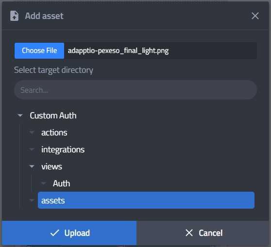
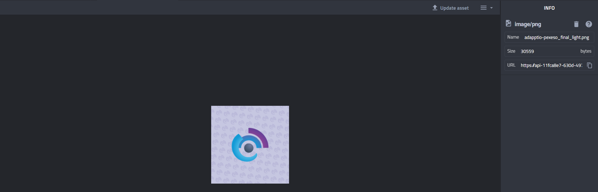


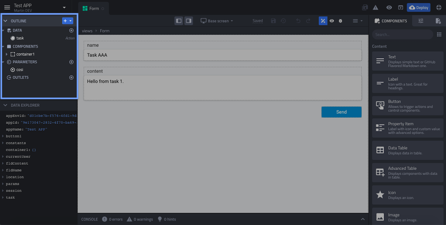

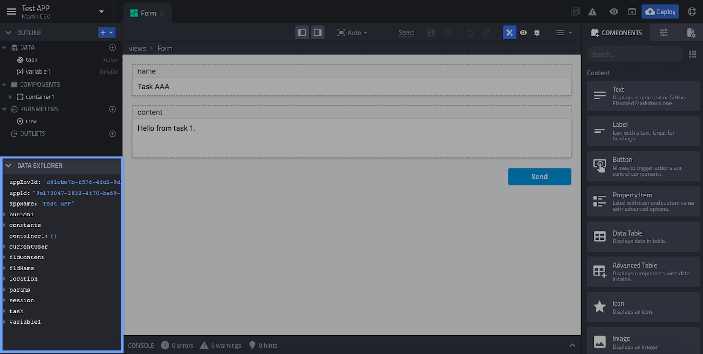


 Next add `Set session` node and store received token as the user identity, again it depends how the previous endpoint returns token.
 And the last step is to add the `Login` node and connect all together. Entire flow would look like this:

### Logout
The logout action is very simple, just add the Logout node, connect it and save.

### GetAccount
You have to turn off authenticated user again - the same way as you did in the Login action.
Then add a request to your API to obtain user's profile. Set Bearer authorization and link it with the session's `identityKey` where the JWT token is stored.
{% hint style="info" %}
`session.identityKey` now you can use in any other API requests to authorize user.
{% endhint %}

And finaly set output to your account data.

## Change Auth type to Custom
Open the app configuration from main menu and change AuthType to Custom. There are two actions to set.
And the last step is to add the `Login` node and connect all together. Entire flow would look like this:

### Logout
The logout action is very simple, just add the Logout node, connect it and save.

### GetAccount
You have to turn off authenticated user again - the same way as you did in the Login action.
Then add a request to your API to obtain user's profile. Set Bearer authorization and link it with the session's `identityKey` where the JWT token is stored.
{% hint style="info" %}
`session.identityKey` now you can use in any other API requests to authorize user.
{% endhint %}

And finaly set output to your account data.

## Change Auth type to Custom
Open the app configuration from main menu and change AuthType to Custom. There are two actions to set.


 ### 3. Add Data Source
Now, in your view, add **Data from action** and in the inspector, select the action you've created in the first step - `GetCompletionItems`.
Change the *data source* ID to `completionItems`.
Then link the `search` parameter to the `customValue` property of the **Options** component. To do that, set the `search` parameter to *fx* and enter the following expression.
```
optionsField.customValue
```
The `customValue` property contains a text a user enters during the search. So when the user is searching, this expression will update the action parameter, and new completion items will be loaded.
### 3. Add Data Source
Now, in your view, add **Data from action** and in the inspector, select the action you've created in the first step - `GetCompletionItems`.
Change the *data source* ID to `completionItems`.
Then link the `search` parameter to the `customValue` property of the **Options** component. To do that, set the `search` parameter to *fx* and enter the following expression.
```
optionsField.customValue
```
The `customValue` property contains a text a user enters during the search. So when the user is searching, this expression will update the action parameter, and new completion items will be loaded.
 ### 4. Link Completion Items to Options Component
The final step is to link data from the action to the Options component's items.
Select the Options component and configure the **Items** property to *fx,* and enter the expression:
```
completionItems.data
```

### 5. Test It
Then switch to the *Preview mode* and click on the Options component. You should see all the items, and when you start typing into the search field, only the matching items should be visible.
### 4. Link Completion Items to Options Component
The final step is to link data from the action to the Options component's items.
Select the Options component and configure the **Items** property to *fx,* and enter the expression:
```
completionItems.data
```

### 5. Test It
Then switch to the *Preview mode* and click on the Options component. You should see all the items, and when you start typing into the search field, only the matching items should be visible.


